I noticed that some sixties posters and film costumes have a strong Art Nouveau and Pre-Raphaelite vibe, so naturally I turned to my art, culture and music bible when it comes to the Swinging Sixties – book ‘Syd Barrett and Pink Floyd: Dark Globe’ by Julian Palacios, And here’s what I found. So, in this post we’ll take a look at the influence of Art Nouveau, Aesthetic movement and 19th century Orientalism on 1960s posters, designs, fashion and film costumes. I’ve also chosen some whimsical psychedelic tunes that I love and that fit very well with the mood of the post. Psychedelic Autumn, is it not?!

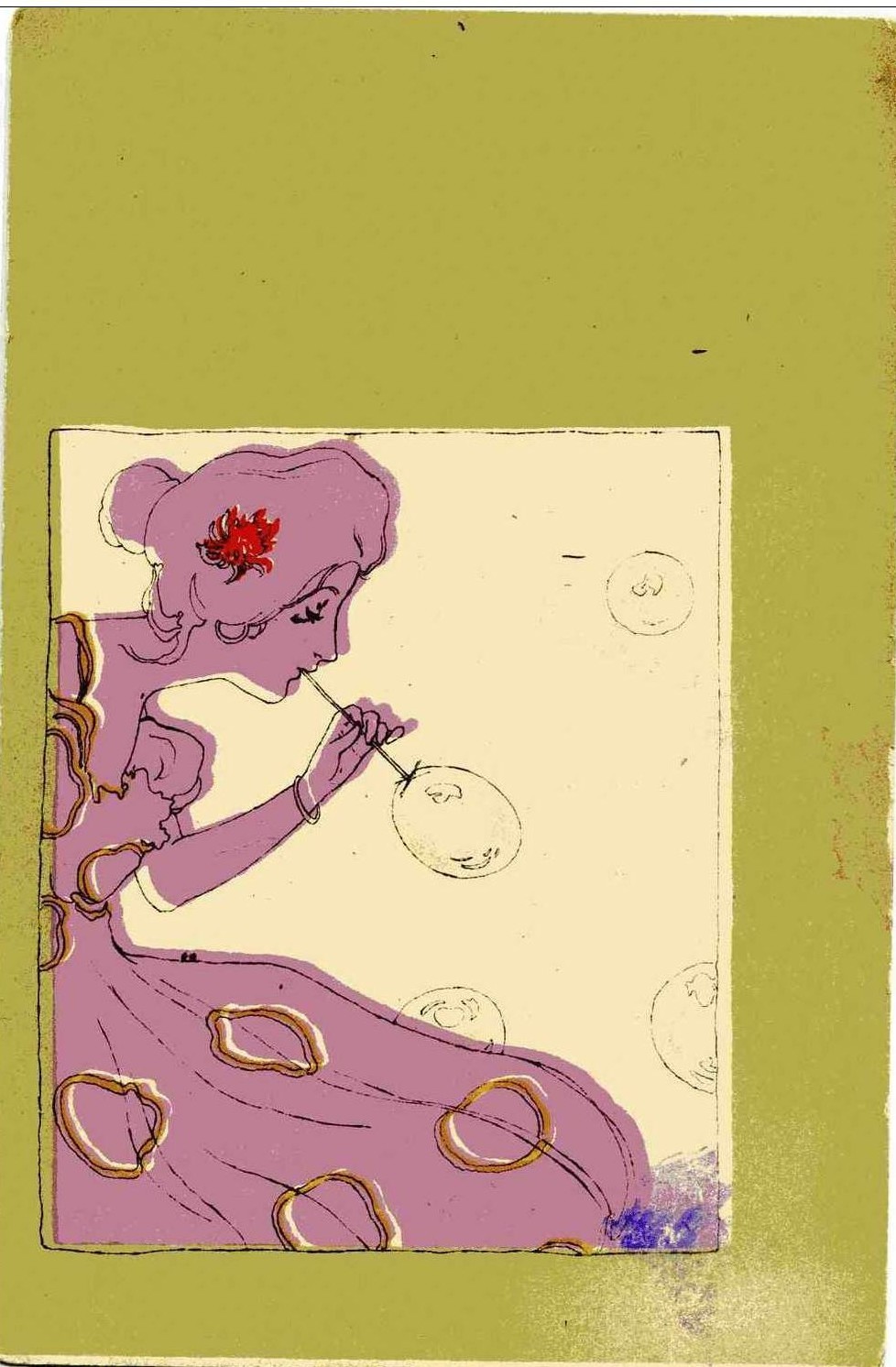
Flower Power fashion, Photograph by Peter Knapp, 1967, Image scanned by Sweet Jane
Donovan – Season of the Witch
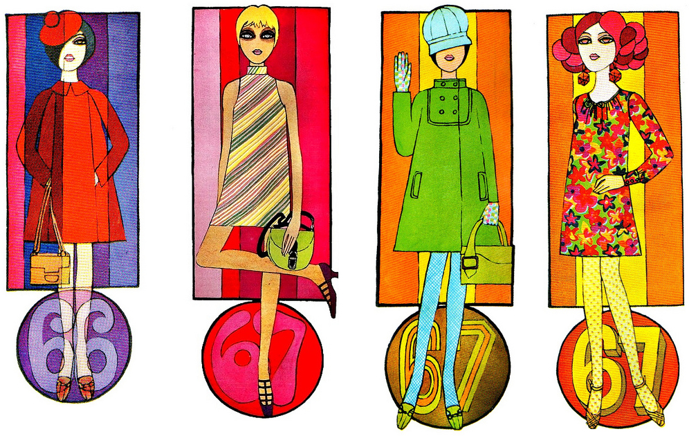
Around 1966/67 there was a shift in style and mood. A change was in the air, as ‘vibrant coloured clothes and laughter’ filled the drab tube stations. Waning Mod fashion was quickly being replaced by a style more romantic and oriental. The new mood, exhibited not only in clothes but in posters, designs and music, found its inspiration in nostalgic reveries of the past and romantic daydreams about far East. Gone were the days of short skirts and fake eyelashes. Instead, young people – students, artists, musicians, groupies and dollies – traded their black and white geometrical outfits for caftans, vibrant coloured long dresses, long hair and less make up.


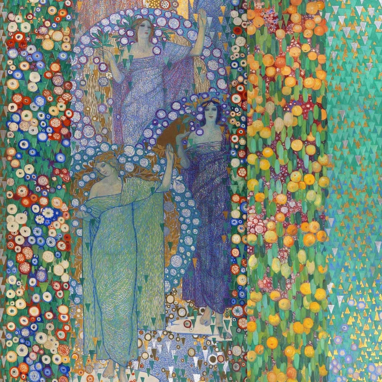
Do you notice the similarity in colours and composition between the sixties illustration (above) and Mucha’s painting ‘The Precious Stones (Ruby, Amethyst, Emerald, Topaz) from 1900.
Cosmic Sounds – The Zodiac
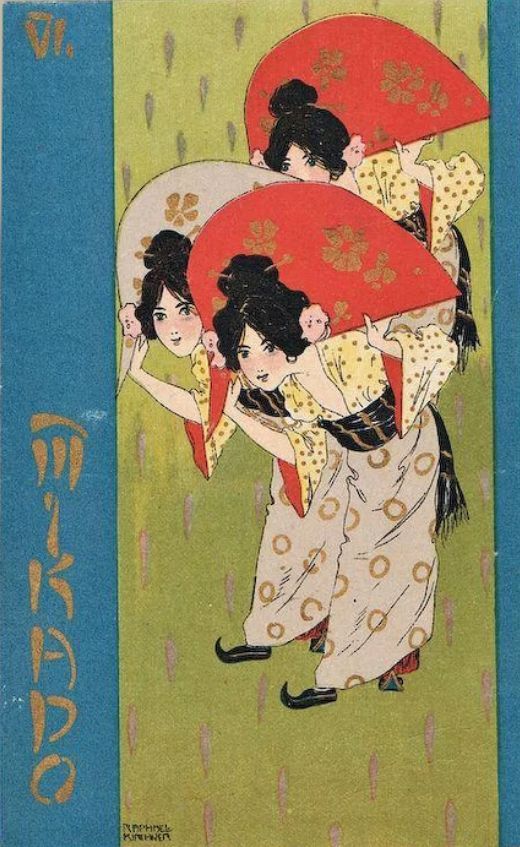
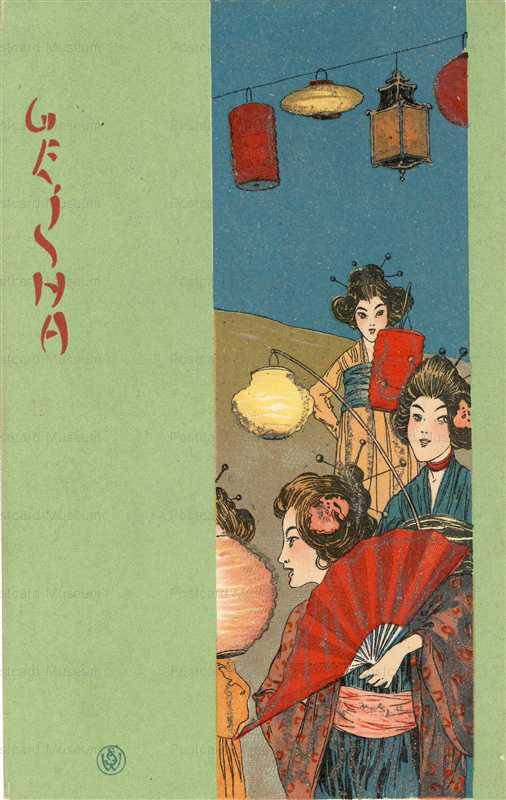
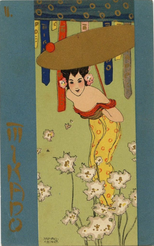
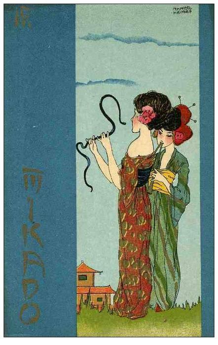
In late sixties, when Mod culture was starting to be looked upon as too commercial, and ‘futuristic themes gave way to exoticism, romanticism and nostalgia’ (1), young people started seeking answers and inspiration in paganism, mysticism and Eastern stuff: I Ching, Bhagavad Gita, The Golden Bough by James George Frazer which explores ‘magic, myths, Druids and Viking lore’, (p. 91), Ouija boards, tarot cards, meditation, vegetarianism and Hindu scriptures. Driven by LSD and hashish, they believed they were creating a new world, and so they delved into mysticism, found beauty in forgotten illustrations and paintings, whether it’s the sumptuous Klimt’s golden paintings or intricate William Morris wallpapers or William Blake’s drawings, laden with spirituality, hidden meanings and symbolism.

1) Baby Doll Cosmetics 1968/ 2) Photo of Cleo de Merode, 1905; similar hairstyles.
Ravi Shankar – Sitar
A quote from the already mentioned book that sums it all:
“The underground exhibited a curious nostalgia, unusual in people so young. Living in tattered Victorian flats, smoking dope and rummaging for antiques on the Portobello Road, the underground pillaged their cultural history. Part romantics and part vandals, as they pulled away from their parents’ world, they embraced the shadow of their grandparents’ Victoriana, torn between an idealised future and rose-tinted visions of the past.”

1) Flower Love, C.Keelan, 1967/ 2) Painting by Mucha
Just imagine that beautiful asceticism of the sixties; candle lit room with bare floor, mattress, incense sticks, Eastern fabrics for curtains, someone jamming on the guitar, girls in colourful clothes with flowers in their hair, resembling Mucha’s painting, laughter, optimism, mind expanding chatter… General mood of the time could be described as a combination of idealism, hedonism and optimism that eventually exceeded into decadence. Similar were the turn of the century vibes and the art movement that came to define the era – Art Nouveau.

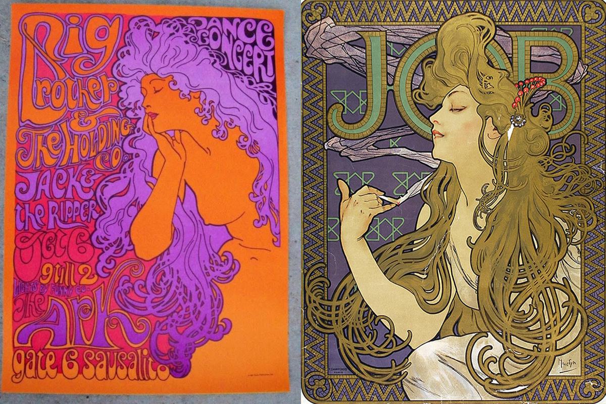
1) 1960s poster/ 2)Alphonse Mucha, ‘Job’, 1898
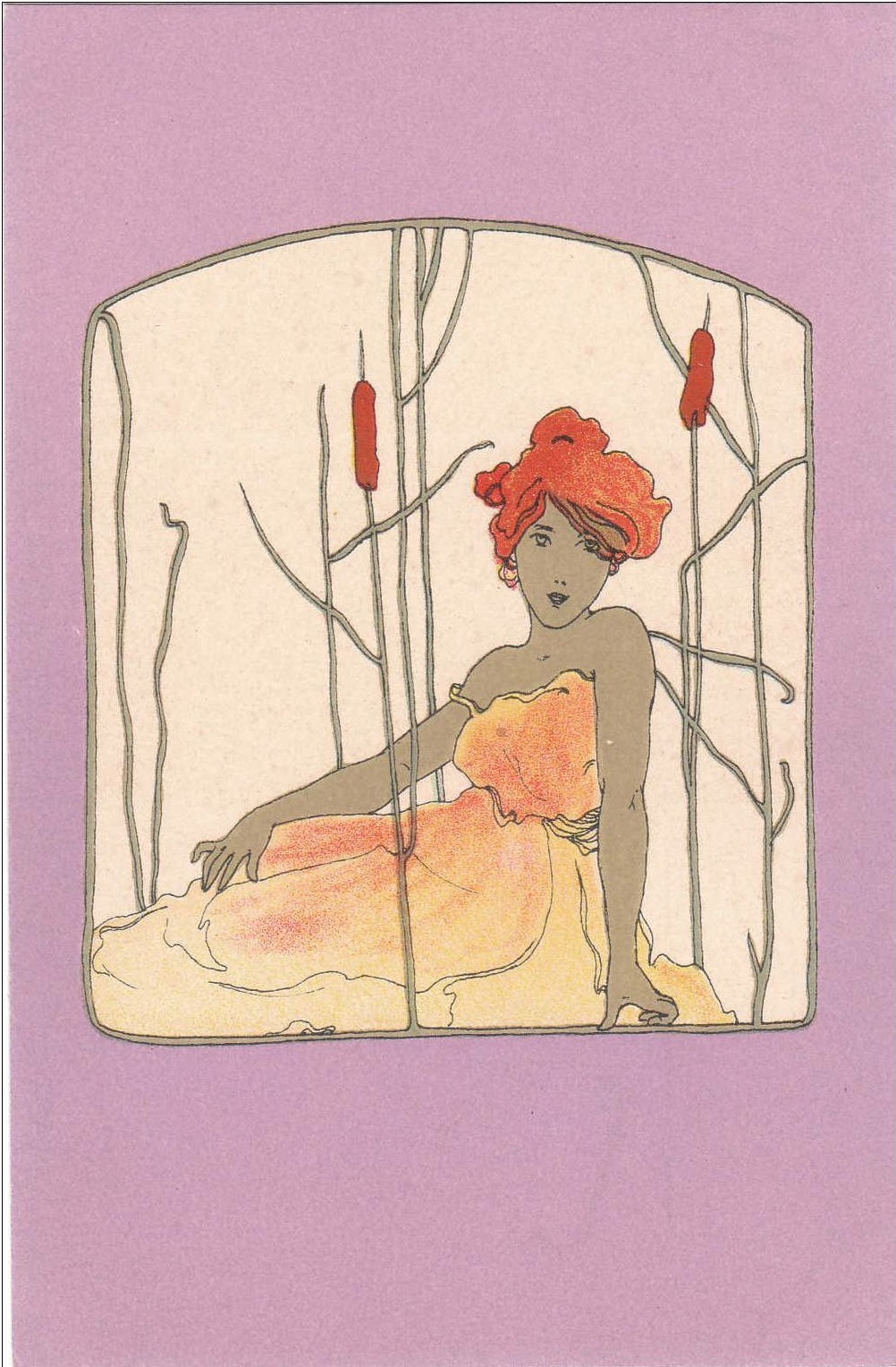
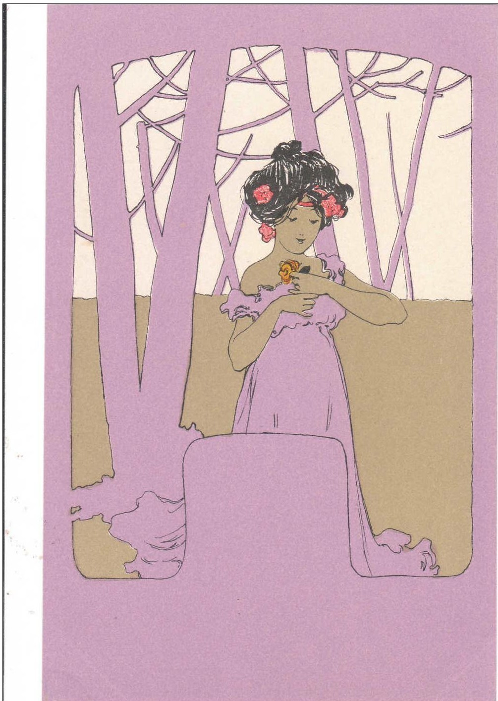
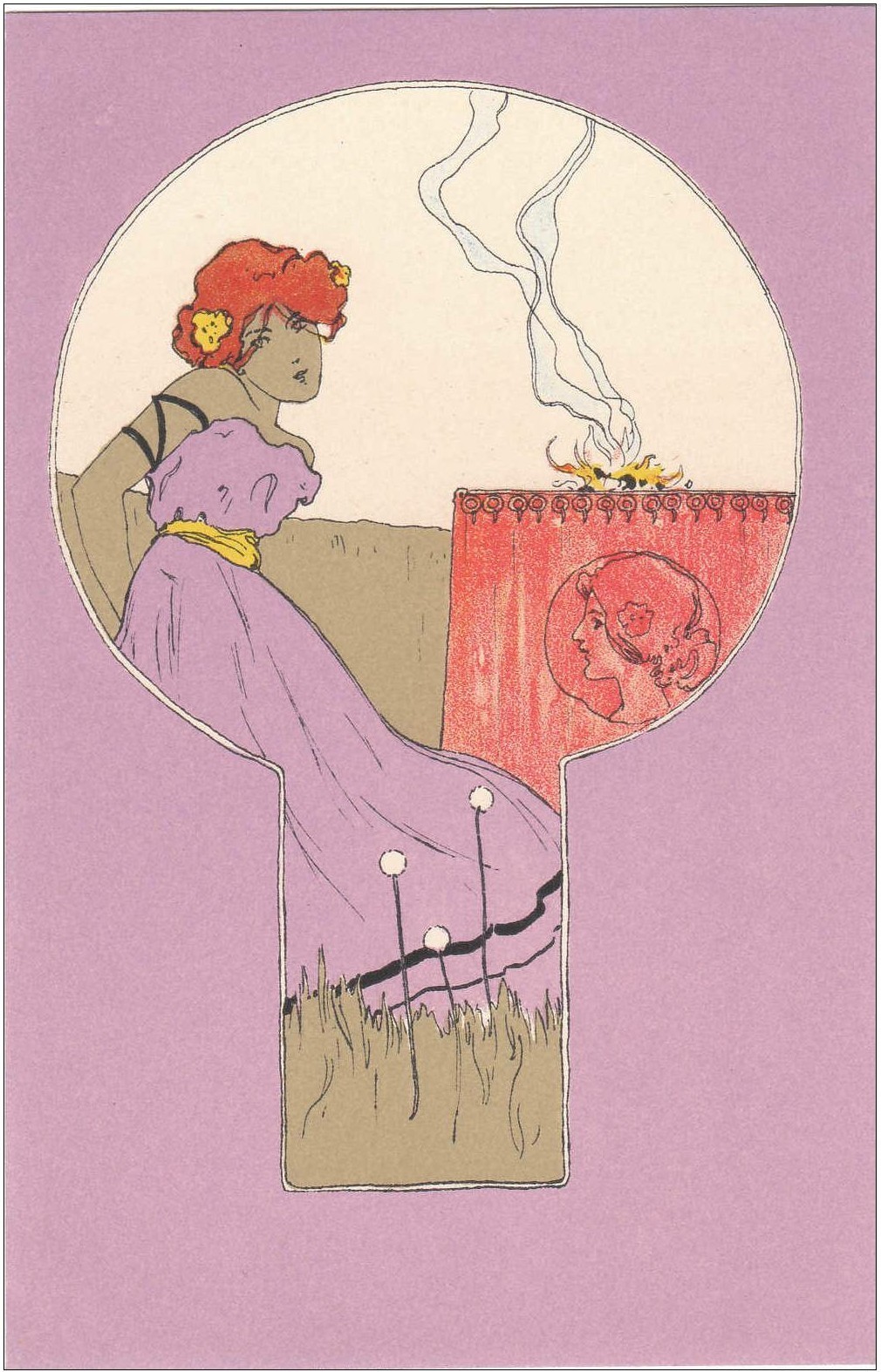
Art Nouveau demanded artistic freedom, art for art’s sake. Free the colour, the line, the beauty itself, the artists demanded. Similarly, in the sixties, after the drab post-war years were finally over and the economic situation was a bit better, artists and designers demanded the liberty of colour and design. Taking inspiration from the past, in a hope for a better artistic future, designers combined the refinement and elegance of Victorian and Edwardian art; floral prints, aestheticism and playful lines, and combined it with acid-laced colours such as magenta, aqua and bright yellow. Inspiration was often found in flamboyant turn of the century designs by Klimt, Aubrey Beardsley, Mucha and Georges de Feure.

1) Poster for The Crazy World of Arthur Brown at UFO, 16 and 23 June, by Hapshash and the Coloured Coat, 1967, London (Michael English & Nigel Waymouth / 2) 1897-98. Journal Des Ventes, Georges de Feure, Color lithograph
As you can see above, poster for the UFO designed by Michael English and Nigel Waymouth who worked under the moniker ‘Hapshash and the Coloured Coat’, is truly Art Nouveau in style; whimsical lines, fluid shapes amalgamating one into another, female figure with flowers and different ornamental detailing in her hair and on her body, the whole mood very playful and fit for the new sixties spirit and yet beautiful aesthetically.
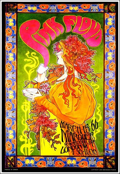
Psychedelic poster, Pink Floyd, 15 March 1966
A sixties touch in designs is definitely colour which is often bright, contrasting and eye-catching, whereas the turn of the century style preferred more refined colouring, jewel-like colours being popular but always combined with subtler shades. Klimt, Mucha and Georges de Feure placed the attention on ornamentation, almost Baroque in its heaviness, whereas in the sixties, the designs were made for the tuned-in folk, and colour combination such as mauve and yellow, orange and lilac, red and green appealed to the crowd. Psychedelic flamboyancy owes it all to Art Nouveau (and LSD).
“Hapshash and the Coloured Coat’s posters rejected the stark formalism of graphic design in favour of referencing the 19th century illustrators William Morris and Aubrey Beardsley, with opium-laced flora and leaves drawn in interlaced patterns, hypnotic motifs and arabesques.“(p. 147)

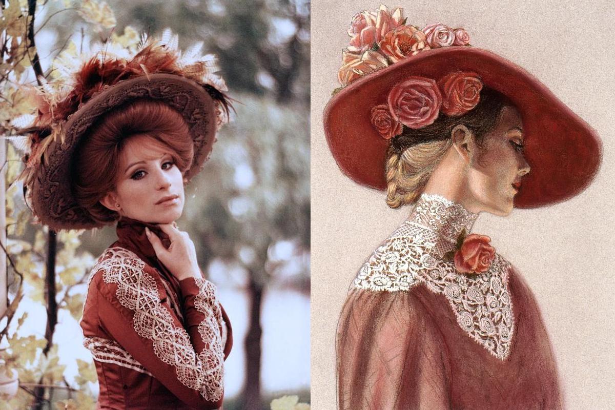
1) Barbra Streisand in Edwardian-inspired dress and hairstyle/ 2) Biba drawing

1) Barbra Streisand /2) Edwardian illustration
The book also mentions illustrations by Arthur Rackham, a late Victorian and Edwardian era book illustrator who portrayed subjects from Nordic mythology to scenes from Shakespeare and Alice in Wonderland: “Art Nouveau posters by Alphonse Mucha and illustrated books by Arthur Rackham, dented silver carafes, spindly umbrellas with ivory handles, and chipped porcelain tea services formed a backdrop for an undulating mass along Portobello, Curving to Landbroke Grove…”
And it seems to me that the sixties were one really long Mad Hatter’s tea party with great clothes, music and attitudes towards life and spirituality.

1) Pattie Boyd and Twiggy for Vogue, 1969 / 2) Barbra Streisand in Edwardian dress
Influence of Art Nouveau, Pre-Raphaelites and Edwardian era can be seen not only in visual arts but also in fashion and film costumes. In 1990s there was a Jane Austen revival with films such as Sense and Sensibility. Well, films from the sixties and seventies are all about turn of the century; large hats decorated with roses, Art Nouveau interiors, Edwardian dresses in pastel colours with abundance of ruffles and lace… Some great examples of this aesthetic are films Hello, Dolly (1969) with Barbra Streisand, La Ronde (1964), Morgiana (1972), Viva Maria (1965) with Brigitte Bardot and Jeanne Moreau, Baba Yaga (1973) etc.

1) Catherine Deneuve in Edwardian dress / Photo of Emilie de Briand, 1900s
Even in everyday fashion, it’s hard not to see the influence. No, women didn’t return to tight corsets and uncomfortable lingerie, but some designers such as Barbara Hulanicki of Biba took the best of Victorian and Edwardian fashion and incorporated it in sixties style. Think of longer dresses (compared to Mary Quant’s mini dress that ruled the Swinging London), straw hats and lace details, floral prints, velvet, bishop sleeves, heavy dark coloured fabrics, longer hair often with curls (instead of the previous strict bob hair) or soft voluminous buns that were worn by Pattie Boyd and Twiggy for Vogue in 1969, and also Catherine Deneuve and Brigitte Bardot. Jane Birkin couldn’t resist the style as well, picture below:

Jane Birkin in Edwardian dress with lace and ruffles, 1970

1) Biba girl with Gibson Girl Hairstyle, 2) Illustration by Alphonse Mucha, 3) Biba illustration
Tags: 1900s, 1960s, 1970s, aesthetics, art, Art Nouveau, Aubrey Beardsley, Barbra Streisand, Biba, design, fashion, Flower Power, Georges de Feure, Hello Dolly (1969), Hippie, Julian Palacios, Klimt, La Belle Epoque, London, Mucha, Swinging London, Syd Barrett, Syd Barrett and Pink Floyd: Dark Globe, Victoriana

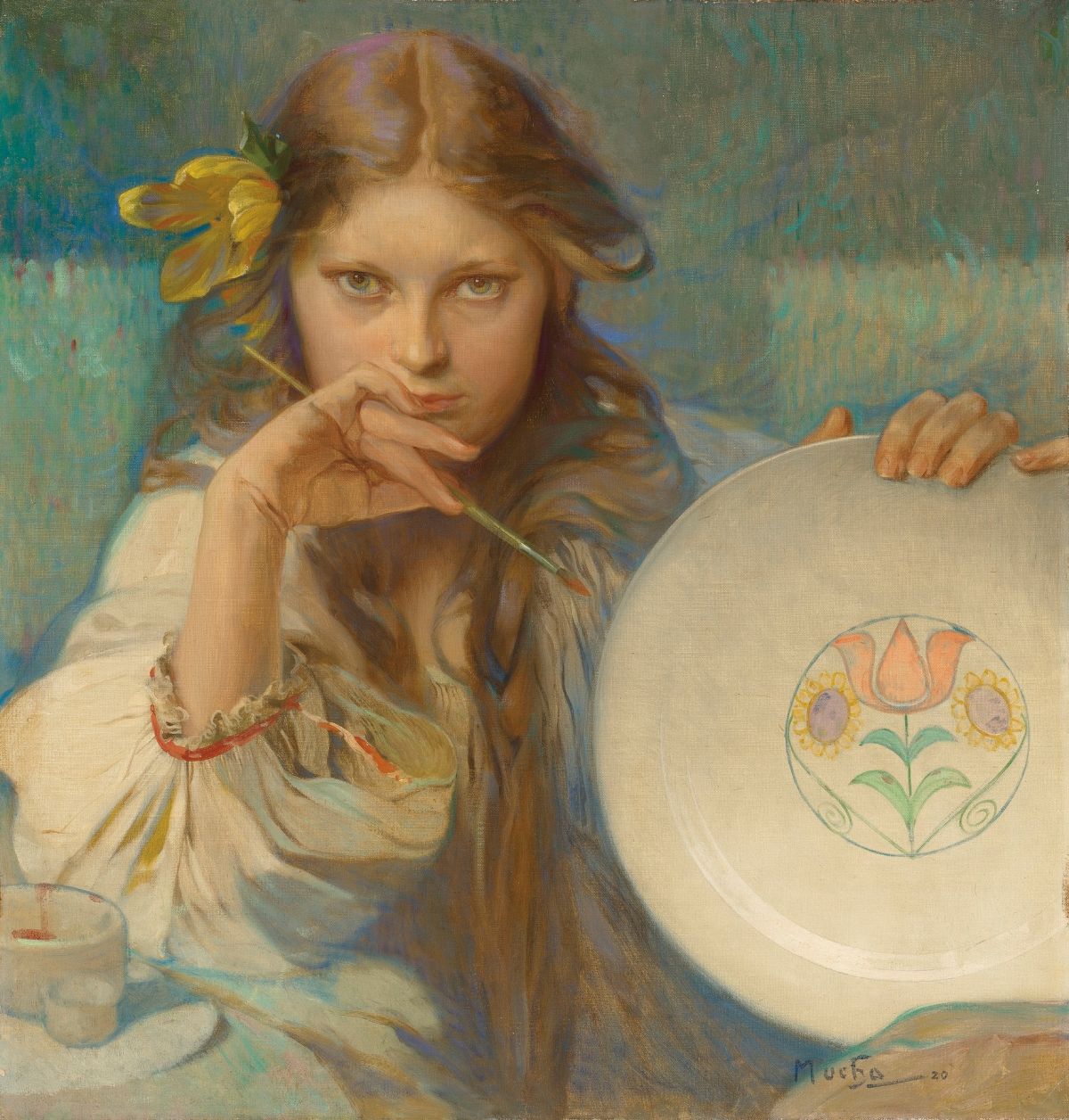 Alphonse Mucha, Girl With a Plate With a Folk Motif, 1920