Tag Archives: 1901

Gustav Adolf Mossa – Salome

4 Feb

“I’d done it before
(and doubtless I’ll do it again,
sooner or later)
woke up with a head on the pillow beside me – whose? –
what did it matter?

Good-looking, of course, dark hair, rather matted;
the reddish beard several shades lighter;
with very deep lines around the eyes,
from pain, I’d guess, maybe laughter;
and a beautiful crimson mouth that obviously knew
how to flatter…
which I kissed…
Colder than pewter.
Strange. What was his name? Peter?

Simon? Andrew? John?
(….)
In the mirror, I saw my eyes glitter.
I flung back the sticky red sheets,
and there, like I said – and ain’t life a bitch –
was his head on a platter.”

(Carol Ann Duffy, Salome)

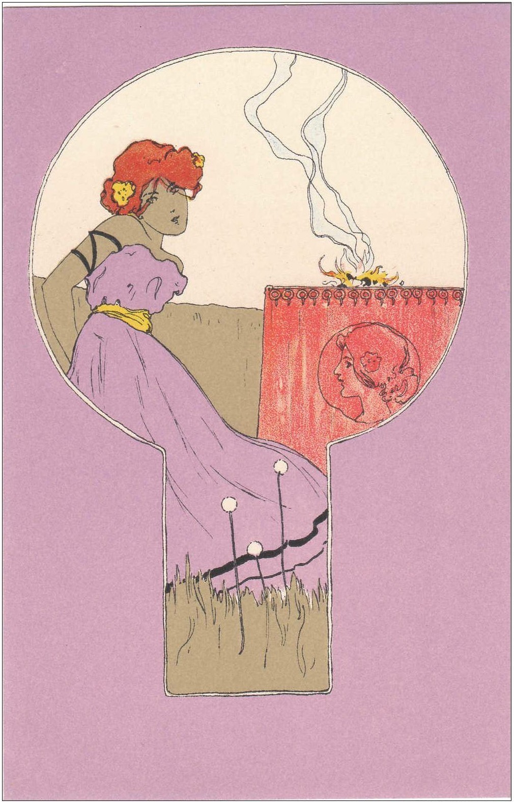
Gustav Adolf Mossa, Salome, 1901

Gustave Moreau painted many and many depictions of the legendary dancer and femme fatale Salome, and while I enjoy the rich, jewel-toned, dense and claustrophobic mood portrayed in those paintings, I think that Gustav Adolf Mossa’s watercolour of Salome is particularly striking because it is both more simple and more twisted than any of Moreau’s paintings. Salome is portrayed at once as a dangerous, blood-thirsty seducer and destroyer of men, and, as an innocent little girl. It is as if her girlhood and womanhood are having a dance. She is shown kneeling on the bed, dressed in a flimsy white gown, a nightgown most likely, holding a big sword and licking the blood off of it. Behind her are four large blooming pink roses with rusty thorny stems and in each rose is a decapitated head of a man – the head of St John, which was what she had requested as a gift for her beautiful dance. The heads, still oozing blood and with horrified face expressions, are truly a sight to see, but Salome, in her dainty white bed, doesn’t seem disturbed at all. She is girlishly unaware of the blood and screams. Her face and body are delicate, pale and doll-like. Beside her on the bed we can see a black comb and a doll, as if she were a little girl who has done nothing wrong. A pretty little coquette is what she is. Her thigh and bosom are peeking out in a seductive manner and there are opulent rings on her slender fingers – womanly things. And yet there are little black bown on her dress, and one in her hair  – a girlish thing.

French Gustav Adolfo Mossa spent his late teens and most of his twenties painting in a Symbolist style and so that first artistic period in Mossa’s oeuvre is called the “Symbolist period” and it lasted from about 1900 to 1911. Later, upon moving to Bruges, he discovered Flemish paintings and his art drifted in another direction. In his Symbolist phase Mossa created a macabre and disturbing yet vibrant world littered with femme fatales and saints, heroes and heroines from Shakespeare, and just random skeletons. Mossa was introduced to the Symbolist art at the Exposition Universelle which he visited in 1900 and after that moment all the inspiration that was mounting in his teenage soul, taken from Art Nouveau and the literary works of Charles Baudelaire, Joris-Karl Huysmans and Mallarmé, suddenly flourished in these watercolours which are all so captivating and full of interesting details. I always felt drown to the spirit of Symbolism, and yet the way these ideas were manifested in the visual arts wasn’t very appealing to me. Now, in the art of Mossa, I found what I was looking for. I love how the classic, well-known themes in art are transformed by Mossa into a festival of blood, bones, lust and roses. The delicacy of watercolour mixed with somewhat gruesome or eerie themes is especially entrancing. The beauty of the Symbolist phase of Mossa’s art is that it both disturbs and bewilders the soul.

Where Do We Go Now But Nowhere? (Odilon Redon’s The Boat)

13 Sep

Around the duck pond we grimly mope
Gloomily and mournfully we go round again
And one more doomed time and without much hope
Going round and around to nowhere…”

(Nick Cave, Where do we go now but nowhere)

Odilon Redon, The Boat, 1901

French painter Odilon Redon’s artistic career seemed to have shifted from one extreme to another sometime in the mid 1890s and he transitioned almost over night from painting eerie and nightmarish charcoal drawings which even caught the attention of the writer Joris-Karl Huysmans and which were mentioned in his infamous novel “A Rebours”, to painting dreamy and mystical scenes in oils and pastels, all in vibrant, groovy colours. I am so glad that he had exhausted all the possiblities that the medium of charchoal offered because, as interesting as I find his early phase when he made charchoal drawings, I do much prefer his colourful post-1895 phase and the pastel “The Boat” which you can see above is a beautiful example of that. Whichever motif he decided to paint there is always something unreal about it. “The Boat” is just one of the many wonderful pastels in which he explores the motif of a boat and sea. These pastels are always colourful but tinged with a sense of mystery; where is the boat going and why? In fact, it seems it isn’t going anywhere, or rather, it’s going nowhere. Both the sea and the sky seem strangely static, there is not even an illusion of the wild and vast sea waves that will rock the boat. Is the boat in the shallow waters, near the coast, or out there in the open sea? It is hard to tell because the painting is closely cropped, but nevertheless there is a sense of loneliness and isolation, as if they are miles and miles away from everything that is familiar. The two mysterious veiled figures sitting “gloomily and mournfully” in a boat appear almost always in these pastel boat scenes by Redon, and the figures are “without much hope, going round and around to nowhere…” What chimes with me so well these days in these boat scenes is a sense of mystery and vagueness. They are gazing upwards but they are no stars in the lavender sky to guide them. Frozen in a colourful dream. The colours and shapes are melting but the mystery remains. The two figures are in a boat going towards an unknown destination, sailing through the uncharted territories of the vast sea and there is no map and no compass for them. As static as it visually seems, this painting symbolises a journey for me; a journey in a physical as much as in a spiritual sense. Where do we go now… but nowhere?

Raphael Kirchner – Lavender Girls and Japonisme

2 Feb

Raphael Kirchner, Girls with olive green surrounds, 1901

Raphael Kirchner was born in Vienna on 5th May 1875. He took music lesson, attended Conservatoire in Vienna and from 1890 to 1894 he was a student at the Vienna school of Art. He began his art career by painting portraits but quickly switched to making illustrations for magazines and newspapers. In 1897 he started drawing illustrations for a woman’s magazine “Wiener Illustrirte”. In 1900 he moved to Paris, settled in Montmartre and it was during this time that he created the most beautiful, most vibrant and captivating artworks. These illustrations were in fact postcards printed in different series with different motifs; for example the “Perfume” series features pretty La Belle Epoque ladies as allegories for different perfume smells such as patchouli or white rose. Kirchner made series which directly take inspiration from Japanese art, such as his “Geisha” and “Mikado” series, but the artworks that I am presenting here today also take inspiration from Japanese woodblock prints but in a more subtle way. The Oriental design is what drew me to these artworks in the first place. Vibrant colours, flat design, stylised figures; these are all the characteristics that Kirchner found in Japanese art but there is something more: the composite format.

Notice how in each of these artworks one composite format is placed withing another. In the example above a crescent shaped format is within the rectangular shape. Some formats are hard to even put in words, the one bellow looks like a keyhole, for example. This compositional method is referred to as “the contest of framed pictures” (“kibori gakuawase sanzu”) in Ukiyo-e art and it really brings excitement to an otherwise plain artwork. The method was also popular with lacquer box decorations and it was taken over by European artists such as Gauguin and even by the English firm Brown-Westhead, Moore & Co on their designs of ornamental plates. Kirchner adopted Japonisme like many European painters before him, nothing original, but these postcards offer a whole new dimension of Oriental inspired art. I love everything about them; the colours are perfect, the ladies enjoying simple activities such as gazing at the birds or butterflies, picking flowers, blowing bubbles, or watering plants, the simplicity of the design; the less is more is really true for Kirchner’s art. The woman in the postcard bellow; her bright yellow glove, her opened fan, her dress dancing in the wind, and the two yellow butterflies in the sky; just how simple yet how charming this is.

Souvenir of Velázquez: John Everett Millais, James Jebusa Shannon and Joaquín Sorolla

13 Sep

Today let’s take a look at three gorgeous portraits of little girls by John Everett Millais, James Jebusa Shannon and Joaquín Sorolla inspired by the paintings of Diego Velázquez’s, mainly the painting “Las Meninas” from 1656 but also some of his other portraits of Infanta Maria Teresa.

John Everett Millais, Souvenir of Velázquez, 1868

Just like Infanta Margaret Theresa from Velázquez’s painting “Las Meninas” (1656), the girl in Millais’ painting is a serious young lady. Two centuries divide the lives of these two moody girls, yet I am sure they would understand each other and could gleefully spend many idle hours giggling and chatting. Millais’ sweet, round faced girl has a pale skin and masses of strawberry blonde hair that are a stark contrast to the darkness of the background. Unlike Infanta Margaret Theresa, this girl is all alone on the canvas. Her face looks like many other from Millais’ canvases, yet her attire is noticeably different from that of any other Victorian girl. This was Millais’ homage to a very famous Baroque painting made by Diego Velázquez, the court painter of Philip IV, in 1656. But Millais used a Pre-Raphaelite colour palette and the brush strokes on the hair and details of the dress are particularly loose, unrestrained and confident. Millais was apparently so skillful a painter that he was able to paint a leaf in a few brushstrokes and achieve the liveliness and accuracy. I think these strokes are a proof of that.

Diego Velázquez, Las Meninas, 1656, detail

Velázquez’s position as a court painter clearly placed him in a subservient position to the members of the royal family. In his time, he was just a painter and they were the grand and powerful Habsburgs and yet, looking back in time, it is Velázquez who is famous and praised now for his art and little Infanta is just one in a row of royal princesses who would scarcely be remembered today if she wasn’t captured on canvas so many times and in such beautiful and memorable paintings. It is a good thing that Velázquez painted so many beautiful portraits of her as a child because those were her glory days in a way; she married at the age of fifteen to Leopold I, and she was both his niece and his first cousin, and died at the age of twenty-one, after giving birth to four children and being pregnant with the fifth. So, if it wasn’t for these glorious portraits and especially the very much loved and enigmatic “Las Meninas” where she is the central figure, she would have been forgotten in history, she would have been just another pale sickly girl who died very young from this illness or another, childbirth or smallpox, nothing special. But because of art, she is eternal. Even now, four centuries later, she is the blue eyed girl looking back at us, with her hair combed on the side and adorned with a bow, in her wide dress, so large for her small fragile body.

Diego Velázquez, Portrait of Infanta Margarita Teresa in silver dress, 1656

James Jebusa Shannon, Portrait of a Little Girl Holding a Toy (Kitty in a fancy dress), 1895

Next example is James Jebusa Shannon’s lovely portrait of his daughter Katherine Marjorie known as Kitty who was eight years old at the time this was painted. The portrait is beautifully cropped and focuses on the little girl in the moment of childlike playfulness; she is holding a doll in each hand. Still in the world of dreams and make-beliefs, her dolls are her friends. Loose brushstrokes and a colour palette of subtle colours such as white and grey, with touches of pink and red perfectly fit the at once playful and dreamy mood of the painting. Maybe Kitty is lost in the dreamland playing with her dolls and she can scarcely notice that her father is painting her once again, for she was his dear model, but her cheeks are rosy and she is smiling and we can tell she is a happier girl than Velázquez’s Infanta Margaret Theresa was in her constricted dress and constricting environment of the Spanish court. The dress Kitty is wearing resembles the one Velázquez painted, but it is only a fancy dress and life is still a game for Kitty as well.

Joaquín Sorolla, María Figuero dressed as a menina, 1901

And the last example I will be talking about in this post is an unfinished work by a Spanish painter Joaquín Sorolla which shows a girl dressed in an attire of the Infanta Margaret Theresa and the kind of dress that would be worn by other noble girls at the court. Just like Kitty in the previous picture, María was eight years old when this was painted and she was not just any child; she was the daughter of Sorolla’s friend Rodrigo de Figueroa y Torres, Marquis of Gauna and later a Duke of Tovar also. Inspiration for this painting was not Velázquez himself, but his pupil Juan Bautista Martínez del Mazo’s portrait of Infanta Margaret Theresa in a pink dress from 1660. Just like in the portrait of Infanta, María Figuero is wearing a very wide dress which fills the canvas horizontally, the sleeves are equally puffy and there is a pink decoration on the bodice. Her hair also resembles the hairstyle Infanta Margarita wore in some of her other portraits, for example the portrait in blue by Velázquez painted in 1659.

Juan Bautista del Mazo, Infanta Margarita Teresa in a Pink Dress, 1660

William Orpen – The Mirror: Why live in the world when you can live in your head?

13 Feb

William Orpen, The Mirror, 1900

This painting keeps haunting me. I don’t quite know why because it’s a really simple portrait, nothing special about it at first sight. I discovered it months ago, and it just lingers in my memory. Every once in a while I remember it and then I gaze it for some time. Then I forget it, and a week passes and then I remember it again and it’s a never ending cycle. The space in the painting isn’t cluttered with many things that tire our eyes. The colours are neutral, greys, black and olive green, nothing overwhelming. The simple arrangement of objects in a painting, with a chest of drawers, a round mirror on the wall and a girl sitting on a chair makes for a simple composition. It also makes it look as if the painter didn’t just capture the space as it was, although it is accurate, but rather chose the objects to make the painting look aesthetically appealing. William Orpen, an Irish painter, was very young when he painted “The Mirror”, just twenty-two years old. He had just recently finished his schooling at the Slate School of Art in London (he studied there from 1897 to 1899), and with this painting he was paying homage to Whistler’s famous “Arrangement in Grey and Black No. 2” or simply A Portrait of the Artist’s Mother painted in 1871. The round mirror on the wall which shows the artist painting is an obvious reference to “The Arnolfini Portrait” painted by Jan van Eyck. But Emily seems to belong to an entirely different world to the one where Orpen is painting. As if the space around her is disappearing and she remains alone on the stage of her life, hiding from us with that hat.

“The Mirror” was painted in Orpen’s lodgings and the model was a girl called Emily Scobel who modeled at the Slade School and was at the time engaged to Orpen, but broke off the engagement the following year and eventually married someone else. She was the main model for Orpen’s early works. With the simple composition and sombre colours, Orpen put a focus on Emily’s face because that’s where the real drama takes place. Her face is very captivating to me and it seems to say so much. Half hidden in the shade of her lovely hat, the same hat you can see in a drawing of Emily that Orpen made in 1901, her eyes are full of doubt and slight disappointment; I feel like she’s come to the point where she doesn’t know what to do with her life and she’s staring into the grey future with worrying eyes that seem to say: and what now? Her shoulders are sloping and her hands are clasped in her laps. She is sitting there in her long black skirt and white blouse, but her thoughts are somewhere else. Cheeks of her round face are pink as roses, but her lips pressed together are hiding secrets that she is hesitant to tell us. When I look at her face, and I have gazed at it for quite some time on different occasions, the lyrics to the Pulp’s song “Monday Morning” comes to mind:

There’s nothing to do so you just stay in bed,

Oh poor thing,

Why live in the world when you can live in your head?


Mmm when you can go out late from Monday,

Till Saturday turns into Sunday,

And now you’re back here at Monday,

So we can do it all over again.

And you go aah ah ah

I want a refund,

I want a light,

I want a reason,

To make it through the night, alright.


And so you finally left school,

So now what are you going to do?

Now you’re so grown up,

Yeah you’re oh oh oh oh oh so mature oh.

William Orpen, A Study – Emily Scobel, 1901, red chalk, graphite and grey wash

This interesting red chalk study of Emily was used to illustrate an article written about Orpen in August 1901 in a magazine called “The Artist”. Not much is known about Emily, and if it wasn’t for her connection with Orpen and her modelling at the Slade School of Art, she would have probably been forgotten in history. She was born sometime in 1877 and in the 1901 UK census, she was listed as a twenty-four year old servant living in Lewisham, London, working for the Churchward family along with a girl called Mary Scobel, who was twenty-two years old at the time and possibly her sister or cousin.

Claude Monet: London Calling – Absinthe Coloured Weather

22 Jan

Every day in London there is beautiful, absinthe-coloured weather. Is that enough to lure you here?‘ (*) – John Singer Sargent wrote in a letter to Claude Monet, on 28 December 1894.

P.S. This is my 300th post!

1903-04-claude-monet-the-houses-of-parliament-effect-of-fogClaude Monet, The Houses of Parliament (Effect of Fog), 1903-1904

And so Claude Monet arrived to London, drawn by Sargent’s promises of the absinthe coloured weather. ‘Cause London is drowning, and I live by the river….’ – Well, that’s not really what Monet had on mind, but his artistic eyes certainly craved to discover London’s magic. And so they did. There were three sights whose beauty Monet captured on his canvases many times; the Houses of Parliament, Charing Cross Bridge and Waterloo Bridge. This dedication to the subject and endless fascination with the same thing is something I really love about the Impressionists.

This wasn’t Monet’s first stay in England though. He spent some time there from September 1870, just after the outbreak of Franco-Prussian war, to May 1871, but his stay wasn’t particularly productive; he painted only six paintings. He did, however, get acquainted with works of John Constable and J.M.W. Turner, and this influenced his later work, especially Turner’s poetic yet turbulent seascapes. He visited London many times since, but this turn-of-the-visits have proven to very special for his art.

1899-1901-claude-monet-waterloo-bridge-overcast-weather-1899-1901Claude Monet, Waterloo Bridge, Overcast Weather, 1899-1901

1903-claude-monet-waterloo-bridge-hazy-sunshine-1903Claude Monet, Waterloo Bridge, Hazy Sunshine, 1903

Monet hardly spoke a word of English, but that didn’t stop him from attending fancy parties and admiring the English culture and way of life. Even at Givery, he practically lived like an English gentleman, wearing suits made of English wool and eating English breakfast every morning. Monet simply fell in love with London in 1871 and he fantasised about painting Thames again, in a completely different manner. With years his painting style has become more whimsical, relaxed and dreamy. So, what stopped his from returning to England earlier? Well, he was occupied with painting his series of paintings portraying the Cathedral in Rouen and ‘wheatstacks’, but after the Dreyfus Affair, he became disillusioned with his homeland, and felt a need to just go away for a while. It’s interesting to note that Monet supported Zola, while Degas and Renoir, for example, became extreme anti-Dreyfusards.

1904-claude-monet-houses-of-parliament-effect-of-sunlight-in-the-fog-1904Claude Monet, Houses of Parliament, Effect of Sunlight in the Fog, 1904

In September 1899 Monet went on a six-week artistic holiday in England. He settled in the Savoy Hotel, ignoring the expenses, which provided him with great views of south London and the Thames. He went on to return to the same hotel for three months the following year, and in 1901 again. All these months spent in London resulted with his biggest ever series of paintings, and, in my opinion, it is one of the most magical of his series, comparable by beauty only to his water lilies. Claude Monet’s ‘London scenes’ are love poems to London, painted with such delicacy, extraordinary mastery of colours and beautifully captured atmospheric effects.

1903-claude-monet-1840-1926-the-houses-of-parliament-sunset-1903Claude Monet, The Houses of Parliament, Sunset, 1903

Here’s an interesting quote about Monet as a landscape painter:

Few landscape painters had been as inventive or as passionate and few had captured nature’s elusive ways with as much power and poetry. Few also were as individualistic or as moody, and few loved the sea more. Turner, therefore, was Monet’s soulmate and guide as well as a special challenge.‘ (Claude Monet – Life and Art, by Paul Hayes Tucker)

1902-claude-monet-houses-of-parliament-1902Claude Monet, Houses of Parliament, 1902

As much as I admire the beauty of ‘Charing Bridge’ and ‘Waterloo Bridge’ series, my personal favourites are Monet’s dreamy portrayals of the ‘Houses of Parliament’ scenes, I find them so romantically exuberant and Gothic, and dreamy in their fiery reds, pink and purples amalgamating one into one another. Paintings from this series in purplish and pinkish shades are my favourites. ‘Houses of Parliament at Sunset’ down below is one that I really love: the colours are so nocturnal and decadent, the Houses of Parliament are protruding from the descending darkness like wraiths, while the alluring burning orange-pink sun invites the viewer to look on the right side of the canvas. Rich atmosphere present in all these paintings is the result of the ‘smoke from the bituminous coal that Londoners burned at the time that mixed with the moist conditions of the region.’

Monet’s ‘series paintings’ were imagined as studies of objects in a way that each painting shows a variation of colour and light effects. They were based on direct observations of nature, but have turned into dreamy illusions where colour, light and texture play more important roles than capturing the reality. Monet’s painting from his late phase are almost anticipating the fantasies of Abstract Expressionism.

1903-claude-monet-houses-of-parliament-at-sunset-1903Claude Monet, Houses of Parliament at Sunset, 1903

Monet pained The Houses of Parliament in dusks, sunsets and mists, bathed in purples, pinks and blues, and some seventy years later, on 7th June 1977, The Sex Pistols played their anti-monarchy song ‘God Save the Queen’ on the boat, while passing The Houses of Parliament, singing ‘There is no future, England’s dreaming’. Many of them were arrested later.

I can’t help it wonder, if buildings could talk, what kind of stories or poems would their tell us? Culture, music and fashion changes, but they stand in silence for eternity, unless someone decides to destroy them, which sadly often happens. Buildings are witnesses to so many things; from peaks and decays of cultures, riots, gossips, kisses and whispers, laughters and shouting. They know everything, they’re worse than Daily Mail!

1899. Charing Cross Bridge - Claude MonetClaude Monet, Charing Cross Bridge, 1899

I remember when I saw the painting ‘Charing Cross Bridge’ in Berlin, and I didn’t think much of it. It seemed so pale, like there’s a gauze veil over it, and I was more drawn to Kirchner’s large canvases of frenzy and anxiety, to notice the simple dreaminess and meditative quality of this painting, woven with lightness, with gorgeous pale blue and the flickering water surface. The simplicity of composition reminds me of the Japanese Ukiyo-e prints, and their way of portraying nature, bridges and rivers.

I have a feeling that, with Monet, the older he got, the better his art was. His early paintings are interesting, no doubt about that, but they look rather conventional and stiff. On the other hand, his London scenes and Water lilies are all capable of inspiring a scale of emotions. He was about sixty years old when he painted those, and older, but I feel that this is the moment his art was truly ripe. That’s the thing that saddens me immensely when I read about an artist who died young, like Modigliani, what would their art develop into?

1900-1901-houses-of-parlilament-sunlight-effect-1900-1901-claude-monetClaude Monet, Houses of Parlilament, Sunlight Effect, 1900-1901

When Monet’s London scenes were exhibited in May 1904, conservative magazine L’Action wrote: ‘In his desire to paint the most complex effects of light Monet seems to have attained the extreme limits of art… He wanted to explore the inexplorable, to express the inexpressible, to build, as the popular expression has it, on the fogs of the Thames! And worse still, he succeeded!’

1900-1901-claude-monet-houses-of-parliament-londonClaude Monet, Houses of Parliament, London, 1900-1901

Do you hear that? London is calling Monet, just like it called Joe Strummer:

London calling, yes, I was there, too
An’ you know what they said? Well, some of it was true!
London calling at the top of the dial
After all this, won’t you give me a smile?
London calling’ (The Clash)*

Cleo de Merode: A Portrait of a Moon Child by Giovanni Boldini

27 Sep

September is nearing its end, it’s the 27th already, and it is also the birth date of Cleo de Merode, the famous French Belle Epoque dancer and beauty.

1901. Cleo de Merode by BoldiniGiovanni Boldini, Cleo de Merode, 1901

La Belle Epoque dancer and a famous beauty Cleo de Merode was born in Paris on 27 September 1875, in times just after the Franco-Prussian war, when the Impressionists were chatting, quarrelling and sketching in Parisian cafes. Her full name, Cléopatra Diane de Mérode, seems to have been made for a star.

It is my opinion that Cleo was equal in beauty and fame to Brigitte Bardot, a fellow French femme fatale. Both studied ballet from an early age, both possessed beauty and charm appealing to the age they lived in, both had numerous affairs interesting to the public eye, and they share a zodiac sign – Libra, Cleo being born on the 27th and Bardot on the 28th September. Although Brigitte Bardot acted in many films, her popularity throughout Europe in the Swinging Sixties was more due to her beauty, lifestyle and sex appeal. Likewise, beautiful Cleo – with oval face framed with masses of thick endlessly long and shiny raven black hair, almond shaped dark exotic eyes – often appeared on postcards, posters and playing cards. Men lusted after her, and women were envious of her bold fashion and lifestyle choices. One of it being the choice of hairstyle, which you’ll see in the photos below. Instead of wearing her hair up like every decent woman would do at the time, Cleo wore her hair down, decorated with a jewelled hairpiece. I found a similar look in a September 1968 drawing ‘Moon Shiny’ for the Baby Doll cosmetics. Whenever I see a photo of Cleo (and I do see it a lot since it’s on my bedroom wall) I instantly think of that sixties cosmetics add and that’s why I decided to put the ‘Moon Child’ in the title. For me, Cleo is the Moon Child of La Belle Epoque.

Her face, if not beautiful by today’s standards, is striking to say the least, more so in the photos than in the painting by Giovanni Boldini. Boldini was the painter of La Belle Epoque. He painted duchesses, courtesans-turned-actresses, beauties and really everyone who could afford his portrait services. Still, out of all his portraits, this one was stuck in my mind for a year now. I like Cleo’s dynamic pose, her sensual nude shoulder, her blue ring and the face expression, so confident, so aware of its own charms. Notice the typical Boldini brushstrokes: swift, dynamic – passionate expression of the moment of creation.

And now a bit of psychedelic music I’ve been listening to a lot this month, The Zodiac by Cosmic Sounds – Libra:The Flower Child for beautiful Cleo:

Libra listens and quietly sings,

gently peeling each yellow note.


Beauty lives within an eye of jade.

Venus contemplates a serene flower,

the color of an hour

of love.

1905. Cleo de Merode by NadarCleo de Merode by Nadar, 1905

1968-baby-doll-moon-shiny-222

Baby Doll ‘Moon Shiny’, 1968

1895-cleo-de-merode-danseuse-et-icone-de-beaute-francaise-1875-1966-photographie-de-reutlinger-paris-1 1895-cleo-de-merode-danseuse-et-icone-de-beaute-francaise-1875-1966-photographie-de-reutlinger-paris

1895-cleo-de-merode-danseuse-et-icone-de-beaute-francaise-1875-1966-photographie-de-reutlinger-paris-2

1890s-cleo-de-merode-18 1890s-cleo-de-merode-11 1895-cleo-de-merode-photographiee-par-charles-ogerau 1903-cleo-de-merode