“I’d sleep another hundred years,
O love, for such another kiss;”
“O wake forever, love,” she hears,
“O love, ’t was such as this and this.”
…..
“O eyes long laid in happy sleep!”
“O happy sleep that lightly fled!”
“O happy kiss, that woke thy sleep!”
“O love, thy kiss would wake the dead!”
(Lord Tennyson, The Day-Dream)
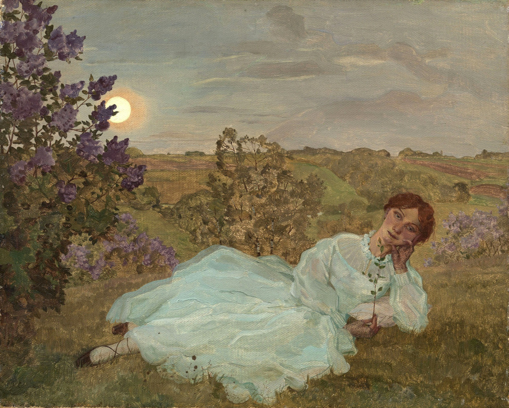
 Carl Krenek (1880-1948), A Fairy Tale Scene – Sleeping Beauty, n.d.
“In the topmost bedchamber of the house he found her. He had stepped over sleeping chambermaids and valets, and, breathing the dust and damp of the place, he finally stood in the door of her sanctuary. Her flaxen hair lay long and straight over the deep green velvet of her bed, and her dress in loose folds revealed the rounded breasts and limbs of a young woman. He opened the shuttered windows. The sunlight flooded down on her. And approaching her, he gave a soft gasp as he touched her cheek, and her teeth through her parted lips, and then her tender rounded eyelids. Her face was perfect to him…”
(Anne Rice, Sleeping Beauty)
French Symbolist poet Stéphane Mallarmé said that “To define is to kill. To suggest is to create”, and even before him, the seventeenth century Japanese poet Matsuo Basho wrote that “a poem that suggests 70-80 percent of its subject may be good, but a poem that only suggests 50-60 percent of the subject will always retain its intrigue”. This way of looking at things stuck with me and, suddenly, while looking at this painting by Carl Krenek and wondering why is it that I love it so much, it dawned on me… The reason for my immense appreciation of Carl Krenek’s painting “A Fairy Tale Scene – Sleeping Beauty” is because of its deliberate vagueness.
I have seen many nineteenth and early twentieth century illustrations of this famous fairy tale, but this one strikes me as the most original and perhaps also the most vibrant and flowery one as well. Instead of boring us with architectural details of the chamber where the Sleeping Beauty is sleeping in her bed, and painting all her entourage and all the sleeping courtiers and what not, Krenek focuses on the bare essentials; the slumbering princess and the roses that have grown over her bed, which are the two main motives of the fairy tale and the most recognisable to our eyes. This instantly brings freshness and our eye is excited. This is not to say that Krenek wasn’t detailed in his approach, far from it. The scene is very detailed, but in areas where it matters. Just look at the meticulous way he had painted all the flowers and thorns and branches, how they fill the space beautifully and naturally.
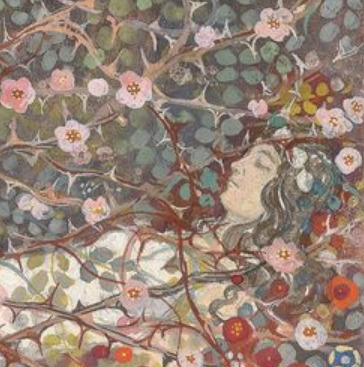

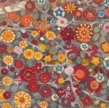
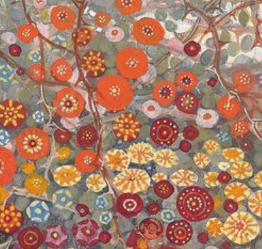
Krenek certainly wasn’t vague when it came to depicting the roses; here is one roses, now you, my dear viewers, imagine the others. No, it seems he really put his heart into all these flowers and they look ever so cheerful and vibrant, from the delicate pink ones above the princess and the more richly coloured red, orange and yellow ones that are growing around her bed. There is little to be seen of the actual Sleeping Beauty; only her pale face with the peacefully closed eyes and her white dress. It seems the roses are more of a main character than she is. Otherwise, I may have preferred to see the princess painted in more details, her beauty more enchanced, but in this painting I find the whole vagueness just delightful and I don’t regret there not being more of a focus on the princess. In fact, our eye may be even more drawn to the princess precisely because we cannot see her clearly. They mystery is alluring.
Sleeping Beauty is perhaps my favourite fairy tale and there are so many ways to look at this story on a symbolic level. Is she really just a princess who fell asleep because of the evil witch, waiting for a kiss to awake her? The theme of awakening can be interpreted in many ways; these days the nature, kissed by spring, is waking up from a long slumber of winter, but also, it can symbolise the girl’s awakening and ripening into womanhood, after that fateful kiss, just as the main character Faustine in the French 1972 film “Faustine and the Beautiful Summer” says, after being kissed by a man for the first time, “With this kiss my life begins!”. Is it the kiss of the Prince which awakens the Sleeping Beauty’s dormant soul, or is a love arrow shot by Cupid from above?
And now, to end the post, here are some beautiful verses from Lord Tennyson’s poem “The Day-Dream”:
“And on her lover’s arm she leant,
And round her waist she felt it fold;
And far across the hills they went
In that new world which is the old.
Across the hills, and far away
Beyond their utmost purple rim,
And deep into the dying day,
The happy princess followed him.
“I’d sleep another hundred years,
O love, for such another kiss!”
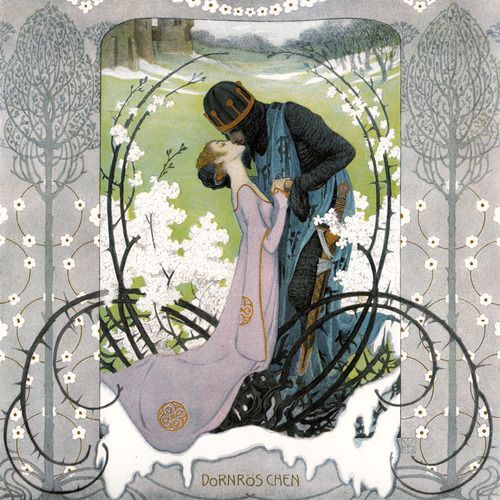
Sleeping Beauty by the Brothers Grimm, illustrated by Heinrich Lefler. Part of a fairy tale calender published by Berger & Wirth, Leipzig, 1905
Tags: art, art blog, Basho, Carl Krenek, fairy tale, floral, flowers, flowery, illustration, Lord Tennyson, love, Mallarme, Painting, Poetry, romance, Rose, Sleeping Beauty, Spring, vague, vibrant, Victorian poet, woman


 Picture found here.