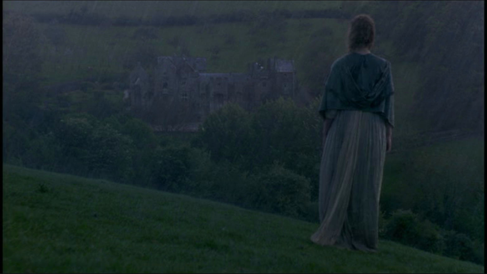


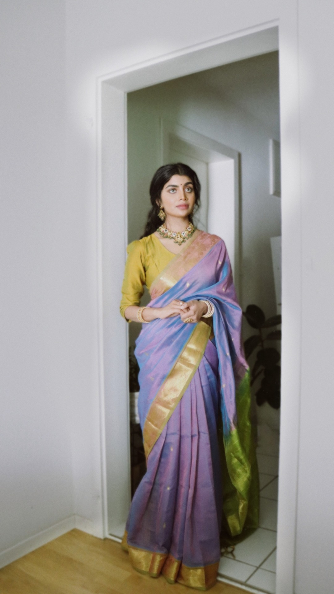
Picture found here.


Picture found here.

Picture found here.
Picture found here.

Picture found here.


Picture found here.
 Alexandra Spencer by Sybil Steele for Spell Designs February/March 2016.


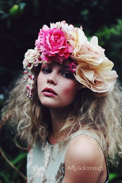
Picture found here.


Scanned by Miss Peelpants from Petticoat, February 1971


*
“A sunset so beautiful that the rest of your life will seem anticlimactic.”
(Disenchantment, S1 E2 )
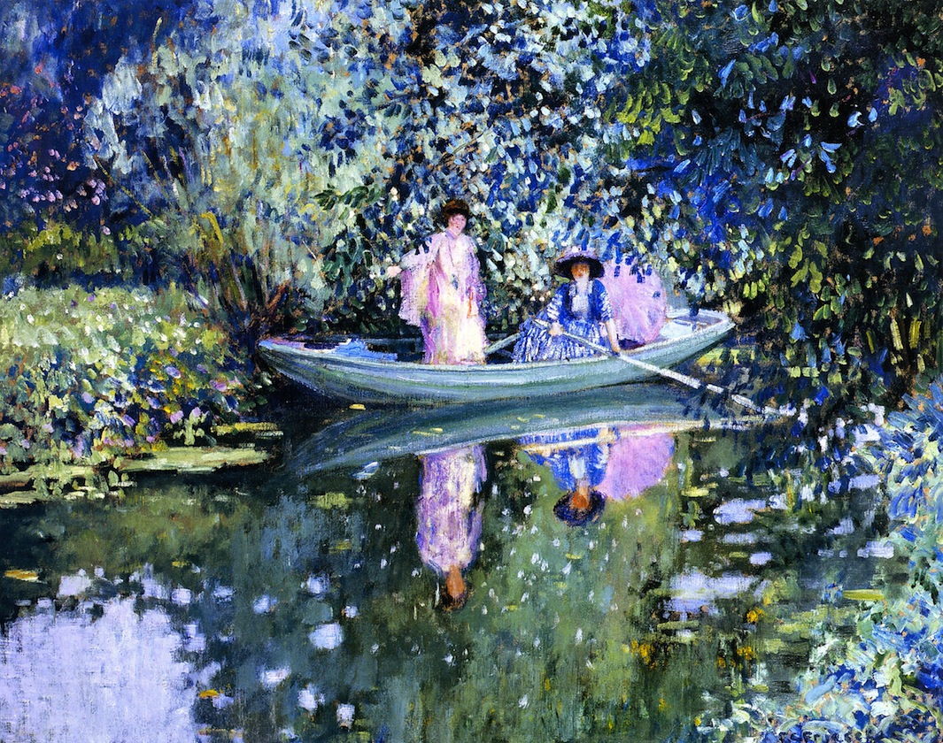
 Felix Vallotton, Yellow and Green Sunset (Coucher de soleil jaune et vert) 1911
The vibrant colours of Felix Vallotton’s painting “Yellow and Green Sunset” from 1911 immediately spoke to me. I am just mesmerised by these rich lavender, yellow and turqouise shades! How dreamy is this purple!? How vivacious and magical this yellow!? This painting is surely one of the most magical depictions of a sunset that I have seen in art. The motif of the painting, that of a beach in the sunset of the day with two small human figures walking by, brings to mind the beautiful and melancholy landscapes of the German Romantic painter Caspar David Friedrich, but the mood and the colours that Vallotton here uses are completely different. Whereas Friedrich would have been subtle and paid attention to shades and tones of colours, Vallotton paints almost as if he trew a bucket of purple, yellow, blue and green onto the canvas. The intense, almost garish colours cover huge portions of the paintings and it is a delight for the eye. The painting is almost made of different horizontal stripes of colour; from the sky to the sea to the beach, but if one looks more closely, one will notice the details such as the purple sky that is made out of pink lines, or the rocks on the beach in the shallow water, colored gold by the light of the fading sun. A few days ago I was sitting by the river and I wittnessed a sunset very similar to the one portrayed in this painting and this connection is something that I cherish. Also, this is my 800th post and I decided to write about this painting because it holds a special meaning for me now. The quote in the beginning of the post comes from the second episode of the first season of the show Disenchantment where the main character Bean and her friends Elfo and Luci are on the Party Barge and the sailor makes a comment on the sunset, that it is “(sunset) so beautiful that the rest of your life will seem anticlimactic,” and for some reason this line stuck with me… The sunset I had seen the other day was indeed mesmerising and its colours were so strong that I felt them impressing themselves upon my soul, the yellow of the sun tastes like sweet mellon… but I do hope the rest of my life will not be anticlimactic now, hehe.
“Darling, it’s only the fairy tales we really live by.”
(Katherine Mansfield, Letter to J.M.Murry, 18 October 1920)
 Wassily Kandinsky, Riding Couple (Couple on Horseback), 1906-07
This magical and romantical painting known under various titles such as “Riding Couple” or “Couple on Horseback” is a beautiful example of Wasily Kandinsky’s early work. The embracing couple dressed in their traditional Russian costumes bring to mind the romantic paintings by a fellow Russian painter Viktor Vasnetstov, particularly his painting “Ivan Tsarevich Riding the Grey Wolf” (1889) which I wrote about here. Kandinsky may be using a similar motif but his treatment of the painting’s surface is completely different. While Vasnetsov tries to evoke the mysterious and romanticised, but still realistically painted, spirit of the forest, Kandinsky transports us into a carnival of colours bursting with energy and vibrancy. Around the riding couple are a few thin elegant birches, and behind them is a scenery made up of a wide river and a townscape with many colourful domes and roofs, reminiscent of the grandeur of Moscow, a town that had a special place in Kandinsky’s heart. The description of the scene makes it sound beautiful, but then upon seeing it, ahh it is a feast for the eyes! Kandinsky here uses a Divisionist method which allows the colour to mix and mingle freely in the eye of the viewer and not on the painter’s palette. He is building the space with little dots, dashes and dabs of colour.
Just look at the outfit the couple is wearing; it’s made out of little dots of blue and pink, then the leaves on the trees just blots of brown and gold, the horse’s body is made up of grey dashes, the river is glimmering in all colours, on the right we see the landscape made up of horizontal dashes, and then the sky, those blues and the purple cloud; it’s woven with magic. The landscape is smiling and flickering like Christmas lights. The orange and red leaves that have fallen on the ground also add to the magical appeal. There is a visual contrast between the shining and inviting city across the river and the solitary, more intimate space hidden by the trees where the lovers on the horse are, as if they are hiding their love, or, the city with its lights and promises of fun and gaiety doesn’t appeal to them because they already found the heaven on earth in each other’s arms. The motif, the scenery and the manner in which it was painted all make it seem as if this is a scene from a fairy tale. Maybe the riding couple were banished from the kingdom on the other side of the river and now, shivering from the chill autumnal air and finding abode in the embrace, they will cast a last, melancholy-tinged glance at the place they use to consider their home…
Bellow you can see a painting from the same time period called “The Colourful Life” and again you see this wonderful technique; vivacious patches of vibrant colour are arising out of a dark background and glowing like gemstones; this is what makes these paintings so enchanting. It also makes me think of mosaic; church mosaics seen in the flickering light of a candle. Take a moment to appreciate the wonderful colours; just look at those gorgeous blues, teal, purple and orange in the painting bellow. It truly uplifts the soul. The characters look like they escaped from the pages of fairy tale books and we have a motif of a castle perched on the top of the hill, all of these little details bring the fairy tale spirit and that is another characteristic of Kandinsky’s early period. And it is interesting to note that even though this is Kandinsky’s early phase, he actually celebrated his fortieth birthday on 16th December 1906, so I guess it goes to show that it is never too late to start a hobby or chase your dream. Age shouldn’t be an impediment to your desires.

Wasily Kandinsky, Das Bunte Leben (The Colourful Life), 1907, tempera on canvas
“Colour is a power which directly influences the soul. Colour is the keyboard, the eyes are the hammers, the soul is the piano with many strings. The artist is the hand which plays, touching one key or another, to cause vibrations in the soul.”
(Wassily Kandinsky, Concerning the Spiritual in Art)
 Henri Matisse, Interior with a Young Girl (Girl Reading), 1904–05
Matisse’s girl in the painting is a quiet little girl, completely absorbed in the book that she is reading. She is seated at the table, perhaps in the dining room. We are somewhat able to decipher the space around her. A bowl of fruits at the table alongside a jug of water. Clearly it wasn’t Matisse’s intention to portray this interior scene in a realistic manner. So what was his intention; playing with colour and appealing to our senses? Perhaps. Matisse is not one of my favourite painters, but when I need my dose of colours and vibrancy I go to Fauvists and their leader Matisse just as the junkie goes to his dealer at the streetcorner. Colour truly has power to uplift us; just look at all the gorgeous, vibrant shades of yellow, red, turquoise, pink, blue and green. So much life and vivacity going on in a single canvas! It’s so childlike and unpretentious. The girl in the painting is Matisse’s ten year old daughter Marguerite who was the daughter of Matisse’s model Caroline Joblaud. Portrait of a girl reading brings to mind the many portraits of children by Renoir who was Matisse’s friend and an artist he looked up to. But in Matisse’s painting the little girl isn’t just a pretty girl in a cozy bourgeoius interior, no, it seems that the colourful patchwork interior composed of contrasting and complementing pathes of colour is actually the interior of Marguerite’s playful, imaginative mind. I imagine that, as she is reading the book, the world around her is transformed accordingly and all the magic of the words and scenes described therein suddently come to life because Marguerite has the power of imagination; she has the power to transcend the ugliness of reality, its dullness and lifelessness, and paint it in all the colours her heart desires, to make it whimsical. And clearly Matisse nurtured his inner child throughout his life, for even his collage cut-outs which he was making in his old days are totally child-like and playful. Matisse transformed the ordinary into extraordinary in this painting. A simple interior scene which might have been boring if painted realistically in shades of brown and beige, is a landscape of vivacity. The space in the painting appears flat but highly decorative and buzzing with excitement. The energy of the painting, and we cannot deny that paintings have energies that directly speak to us, is that of a child’s laughter and play, bright pink ice cream melting in a summer’s day, jumping on trampoline, ribbons, bonbons and candy-floss, the world of fairy tales and make-believe. I don’t know about the rest of you, but when I gaze at this painting, I feel rejuvenated. This just might be one of my favourites by Matisse.
“What is one to say about June, the time of perfect young summer, the fulfillment of the promise of the earlier months, and with as yet no sign to remind one that its fresh young beauty will ever fade.”
(Gerture Jekyll)
 Frederick Carl Frieseke, Lady in the Garden in June, 1911
Painting “Lady in the Garden in June” and many other paintings by the American Impressionist painter Frederick Carl Frieseke perfectly encapsulate the lazy and indolent mood of a summer garden. Female figures in their pretty dresses and fashionable hats serve to beautify the scenes of gardens in bloom, but Frieseke paints both the flowers and the ladies with equal attentiveness and vibrancy, they seem to be a part of the landscape. Gertrude Jekyll, a British Victorian era horticulturist, writer and garden designer perfectly described this transient and illusive, yet magical and captivating mood of June when summer has revealed to us all its charms and we feel the dream will never end. John Singer Sargent encapsulated this same ethereal and dreamy mood in his painting “Carnation, Lily, Lily, Rose“, but with Frieseke it’s not just a single painting which speaks of summer delights, but many.
On these canvases Frieseke translates the charms of summer into an oasis of joyous, vibrant colours and countless little dabs, dots and dashes of paint. In the painting “Hollyhocks” from 1911 you can really see how a few dabs of light pink or red can create a whole hollyhock flower. The painting looks pulsating and alive with all these trembling brush strokes and all these colours and it is easy to see why a critic had referred to Frieseke’s style as “Decorative Impressionism” because he uses the same motives as the Impressionists, the wonderful outdoors with flowers and sunshine, but fills his paintings with details, patterns and shapes and some paintings, such as the one called “Hollyhocks” from 1912-13 reminds me of Gustav Klimt’s landscapes which never feature human figures but are instead made out of garish colours and filled with details leaving no space free of shapes and dabs of rich colour.

Frederick Carl Frieseke, Hollyhocks, by 1911
There is little difference between the figure of a lady and the figure of a flower in Frieseke’s garden scenes, both are here for their beauty, colour and shape, and we can see that in the painting “Hollyhocks” above, from 1911, where the woman is seen from the profile in her garden in bloom and, seen from afar, her lean, upward figure would resemble a tall, lean hollyhock flower. In “Lady in Garden” the domineering pattern are vertical dashes which linger on and on over the canvas creating a rhythm and we can hardly see the line which separates the tall, sharp blades of grass from the stripes on the fabric of the woman’s dress. Although Frieseke was an American artist, in 1898, at the age of twenty-four he moved to France and studied art at Academie Julian. He regularly spent his summers at Giverny and in 1906 he moved into a house there, previously owned by another American painter Theodore Robinson, and found himself being a neighbour of none other but the Father of Impressionism: Claude Monet. Despite this lucky coincidence, Frieseke and Monet didn’t develop a friendship. Frieseke found Renoir to be his inspiration instead, inspired by Renoir’s voluptuous women, vibrant colours and a sense of joie de vivre and sensuality lingering through his canvases. And now, speaking of flowers and lovely gardens in summer reminded me of this passage from Louisa May Alcott’s novel “Little Women”:
“As spring came on, a new set of amusements became the fashion, and the lengthening days gave long afternoons for work and play of all sorts. The garden had to be put in order, and each sister had a quarter of the little plot to do what she liked with. Hannah used to say, “I’d know which each of them gardings belonged to, ef I see ’em in Chiny,” and so she might, for the girls’ tastes differed as much as their characters. Meg’s had roses and heliotrope, myrtle, and a little orange tree in it. Jo’s bed was never alike two seasons, for she was always trying experiments. This year it was to be a plantation of sun flowers, the seeds of which cheerful land aspiring plant were to feed Aunt Cockle-top and her family of chicks. Beth had old-fashioned fragrant flowers in her garden, sweet peas and mignonette, larkspur, pinks, pansies, and southernwood, with chickweed for the birds and catnip for the pussies. Amy had a bower in hers, rather small and earwiggy, but very pretty to look at, with honeysuckle and morning-glories hanging their colored horns and bells in graceful wreaths all over it, tall white lilies, delicate ferns, and as many brilliant, picturesque plants as would consent to blossom there. Gardening, walks, rows on the river, and flower hunts employed the fine days, and for rainy ones, they had house diversions, some old, some new, all more or less original.”

Frederick Carl Frieseke, Lilies, 1911

Frederick Carl Frieseke, Lady in a Garden, 1912, oil on canvas, 81 x 65.4 cm

Frederick Carl Frieseke, Hollyhocks, 1912-13
Frederick Carl Frieseke, Grey Day on the River (Two Ladies in a Boat), c 1908
 Robert Delaunay, Le Premier Disque, 1912-13
If colours were emotions, this painting would be pure joy, euphoria, ecstatic rapture… Delaunay’s painting Le Premier Disque exudes playfulness, mainly because colours are in charge, and geometrical composition isn’t that dominant.
Delaunay’s colours are art therapy for me. This painting resembles a musical symphony, with colours instead of notes; deep red, cherry red, blue as the sky, the sea, then green, green like woods, yellow, van Gogh’s yellow, mystical shades of purple. Delaunay was a lyrical colourist, and after experimenting with Cubism, he returned to his greatest love – colour. He said himself: ‘This happened in 1912. Cubism was in full force. I made paintings that seemed like prisms compared to the Cubism my fellow artists were producing. I was the heretic of Cubism. I had great arguments with my comrades who banned color from their palette, depriving it of all elemental mobility. I was accused of returning to Impressionism, of making decorative paintings, etc.… I felt I had almost reached my goal.‘ It was necessary for him to experiment in order to find his own path, and he did, in 1912, when he finally succumbed to his passion for bright and dynamic colours. But his aim was different than those of Impressionists and Fauvists who still painted portraits and landscapes but with sometimes unnatural colours. Delaunay, like Kandinsky, wanted the paint to became valuable for itself.
Whenever I see this painting, it reminds me of Mayakovsky’s poem ‘But could you?’; in it Mayakovsky splashes a pot of colour on the trivialities of daily life, work-hours and boredom. Delaunay’s painting has the same effect on me; it stands as a spiritual border between school obligations and free time which I cherish immensely.
‘I blurred at once the chart of trite routine
by splashing paint with one swift motion.‘ (‘But could you? by Vladimir Mayakovsky)
For me, this painting is a true visual representation of ‘joie de vivre’, and therefore reminds me of Renoir’s paintings. While Renoir painted people dancing and laughing, Delaunay here uses nothing but colours, but provokes the same feeling from the viewer – joy of life. This is a painting which brings happiness, do you need more?
I’ve already shared Harry Clarke’s illustrations with you, and I’m doing it again because these illustration are so irresistibly magical, colourful, vivid and psychedelic. I really enjoyed gazing at them, and I hope you’ll feel the same.


In April my mind wandered from Regency era to the 1840s. I read Sense and Sensibility by Jane Austen again, and I watched the film, but at the same time I started writing my story again so I had to be absorbed in the 1840s.
Films that inspired me in April are Effie Gray (2014), Cry Baby (1990) and Submarine (2010). I’ve watched documentary The Real Jane Austen, In Search of the Brontes and BBC’s Family Life in the 1960s. And I’ve also watched television series Lost in Austen (2008) which turned out to be rather interesting and it gave me some ideas too. I haven’t been listening much to music in April, only Pulp and Manics (From Despair to Where). Though, a piece of classical music had enchanted me – Liebestraum (Love dream) by Franz Liszt; I’ve been listening to it while writing my story. In art, my interests ranged from Modigliani, Jeanne Hebuterne and Watehouse’s Nymphs to Thomas Lawrence, John Constable and other 18th century British painters.
1830’s and 1840’s fashion plates have given me hours of fun. I really immerse myself into all the details; shape of the sleeves, decorations, bonnets, lace, trims, and colours. I focused on colours this time. Knowing different shades of colours gives you much more variety than just thinking or saying that something is green, when you have lime, pear, emerald, moss, fern green. Colours are so exciting, are they not?!
I’m so sad that yet another April has vanished, but the sweet and flowery month of May is still ahead of us. Lament for my dearest months – April and May…