“What is one to say about June, the time of perfect young summer, the fulfillment of the promise of the earlier months, and with as yet no sign to remind one that its fresh young beauty will ever fade.”
(Gerture Jekyll)
 Frederick Carl Frieseke, Lady in the Garden in June, 1911
Painting “Lady in the Garden in June” and many other paintings by the American Impressionist painter Frederick Carl Frieseke perfectly encapsulate the lazy and indolent mood of a summer garden. Female figures in their pretty dresses and fashionable hats serve to beautify the scenes of gardens in bloom, but Frieseke paints both the flowers and the ladies with equal attentiveness and vibrancy, they seem to be a part of the landscape. Gertrude Jekyll, a British Victorian era horticulturist, writer and garden designer perfectly described this transient and illusive, yet magical and captivating mood of June when summer has revealed to us all its charms and we feel the dream will never end. John Singer Sargent encapsulated this same ethereal and dreamy mood in his painting “Carnation, Lily, Lily, Rose“, but with Frieseke it’s not just a single painting which speaks of summer delights, but many.
On these canvases Frieseke translates the charms of summer into an oasis of joyous, vibrant colours and countless little dabs, dots and dashes of paint. In the painting “Hollyhocks” from 1911 you can really see how a few dabs of light pink or red can create a whole hollyhock flower. The painting looks pulsating and alive with all these trembling brush strokes and all these colours and it is easy to see why a critic had referred to Frieseke’s style as “Decorative Impressionism” because he uses the same motives as the Impressionists, the wonderful outdoors with flowers and sunshine, but fills his paintings with details, patterns and shapes and some paintings, such as the one called “Hollyhocks” from 1912-13 reminds me of Gustav Klimt’s landscapes which never feature human figures but are instead made out of garish colours and filled with details leaving no space free of shapes and dabs of rich colour.

Frederick Carl Frieseke, Hollyhocks, by 1911
There is little difference between the figure of a lady and the figure of a flower in Frieseke’s garden scenes, both are here for their beauty, colour and shape, and we can see that in the painting “Hollyhocks” above, from 1911, where the woman is seen from the profile in her garden in bloom and, seen from afar, her lean, upward figure would resemble a tall, lean hollyhock flower. In “Lady in Garden” the domineering pattern are vertical dashes which linger on and on over the canvas creating a rhythm and we can hardly see the line which separates the tall, sharp blades of grass from the stripes on the fabric of the woman’s dress. Although Frieseke was an American artist, in 1898, at the age of twenty-four he moved to France and studied art at Academie Julian. He regularly spent his summers at Giverny and in 1906 he moved into a house there, previously owned by another American painter Theodore Robinson, and found himself being a neighbour of none other but the Father of Impressionism: Claude Monet. Despite this lucky coincidence, Frieseke and Monet didn’t develop a friendship. Frieseke found Renoir to be his inspiration instead, inspired by Renoir’s voluptuous women, vibrant colours and a sense of joie de vivre and sensuality lingering through his canvases. And now, speaking of flowers and lovely gardens in summer reminded me of this passage from Louisa May Alcott’s novel “Little Women”:
“As spring came on, a new set of amusements became the fashion, and the lengthening days gave long afternoons for work and play of all sorts. The garden had to be put in order, and each sister had a quarter of the little plot to do what she liked with. Hannah used to say, “I’d know which each of them gardings belonged to, ef I see ’em in Chiny,” and so she might, for the girls’ tastes differed as much as their characters. Meg’s had roses and heliotrope, myrtle, and a little orange tree in it. Jo’s bed was never alike two seasons, for she was always trying experiments. This year it was to be a plantation of sun flowers, the seeds of which cheerful land aspiring plant were to feed Aunt Cockle-top and her family of chicks. Beth had old-fashioned fragrant flowers in her garden, sweet peas and mignonette, larkspur, pinks, pansies, and southernwood, with chickweed for the birds and catnip for the pussies. Amy had a bower in hers, rather small and earwiggy, but very pretty to look at, with honeysuckle and morning-glories hanging their colored horns and bells in graceful wreaths all over it, tall white lilies, delicate ferns, and as many brilliant, picturesque plants as would consent to blossom there. Gardening, walks, rows on the river, and flower hunts employed the fine days, and for rainy ones, they had house diversions, some old, some new, all more or less original.”

Frederick Carl Frieseke, Lilies, 1911

Frederick Carl Frieseke, Lady in a Garden, 1912, oil on canvas, 81 x 65.4 cm

Frederick Carl Frieseke, Hollyhocks, 1912-13
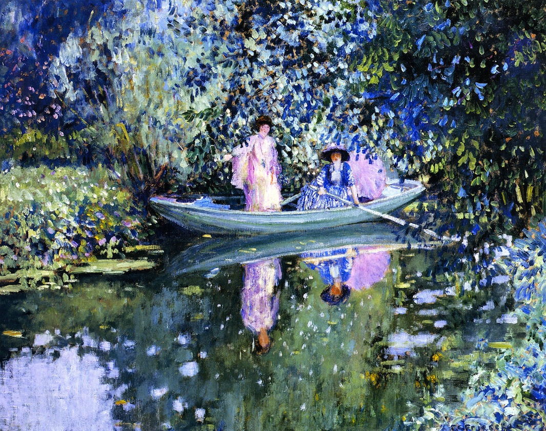
Frederick Carl Frieseke, Grey Day on the River (Two Ladies in a Boat), c 1908
Tags: 1910s, 1911, American artist, art, Colours, decorative, Decorative Impressionism, flowers, Frederick Carl Frieseke, Frieseke, garden, hollyhocks, Impressionism, Lady in the Garden in June, painter, Summer

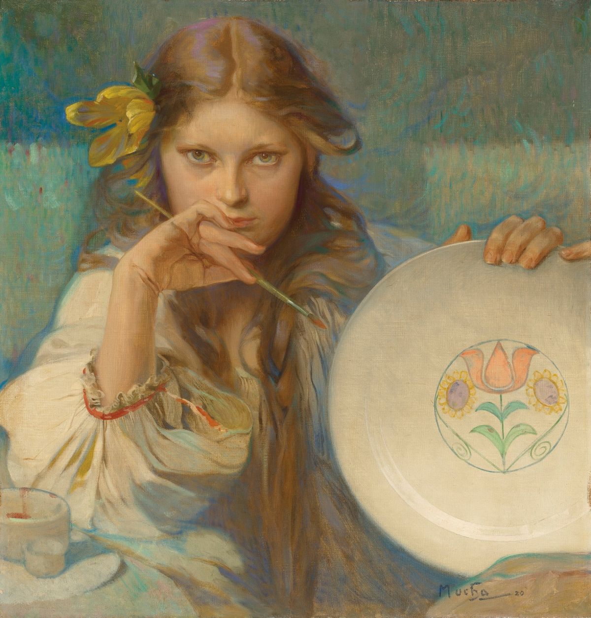 Alphonse Mucha, Girl With a Plate With a Folk Motif, 1920


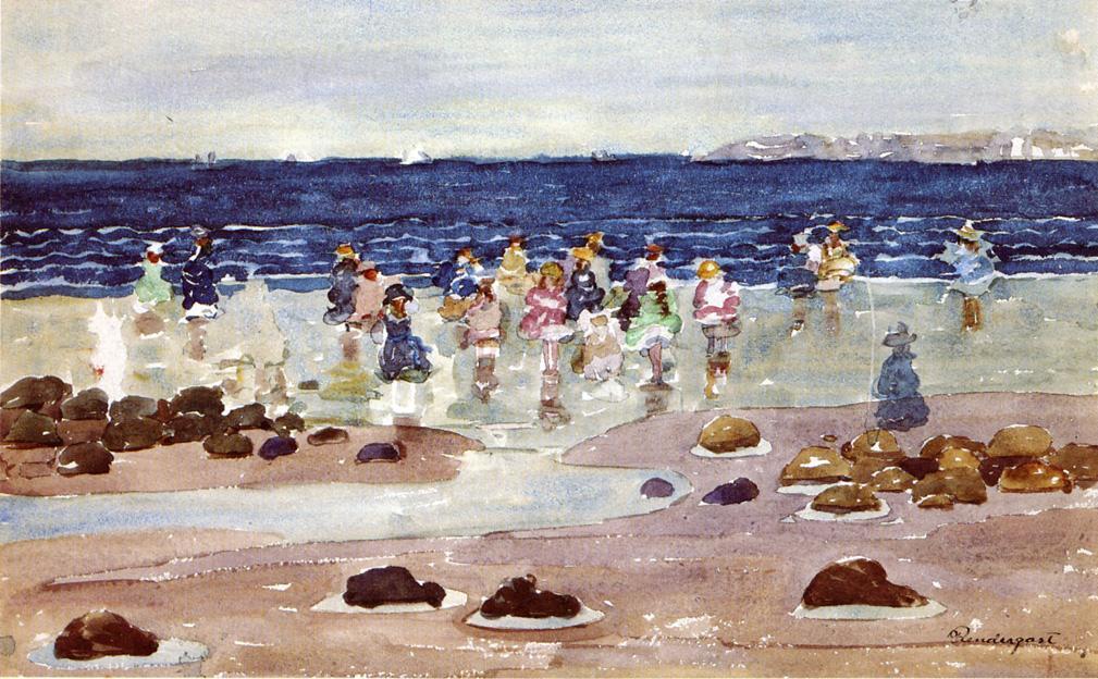
 Maurice Prendergast, Children at the Beach, 1897, watercolour


