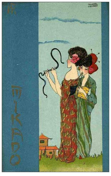
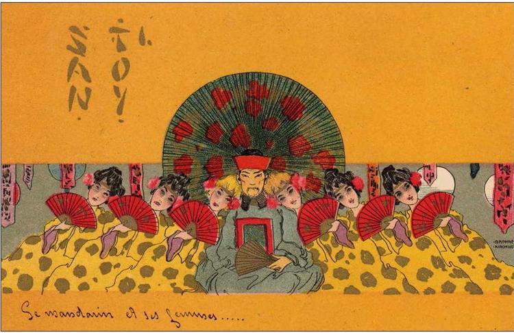
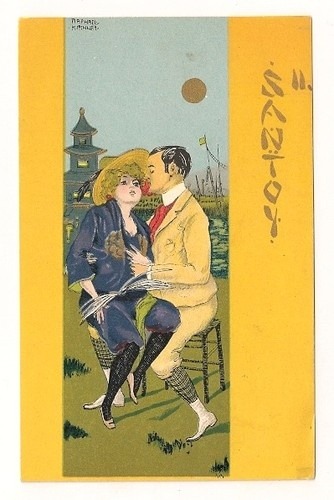
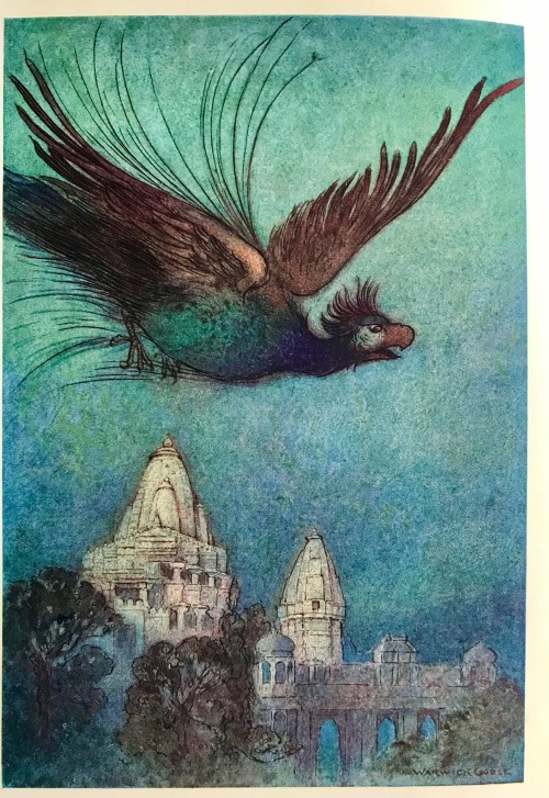
This month I really enjoyed gazing at the dreamy and magical Oriental illustrations by Edmund Dulac and Warwick Goble, some of my favourites are featured here in this post. My other favourites were the Japanese inspired postcards by Raphael Kirchner. I enjoyed rereading Natsume Soseki’s wonderful, meditative and poetic novel “The Three-Cornered World” and also the poetry of Kobayashi Issa and Tagore. Here is a poem by Issa which struck me the most because it conveys such a lovely image:
“In spring rain
A pretty girl
Yawning.”
(Kobayashi Issa)


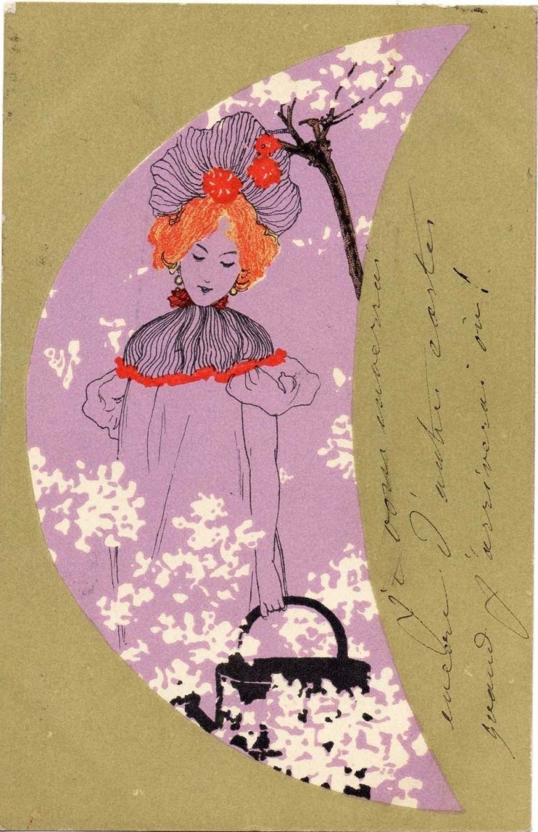
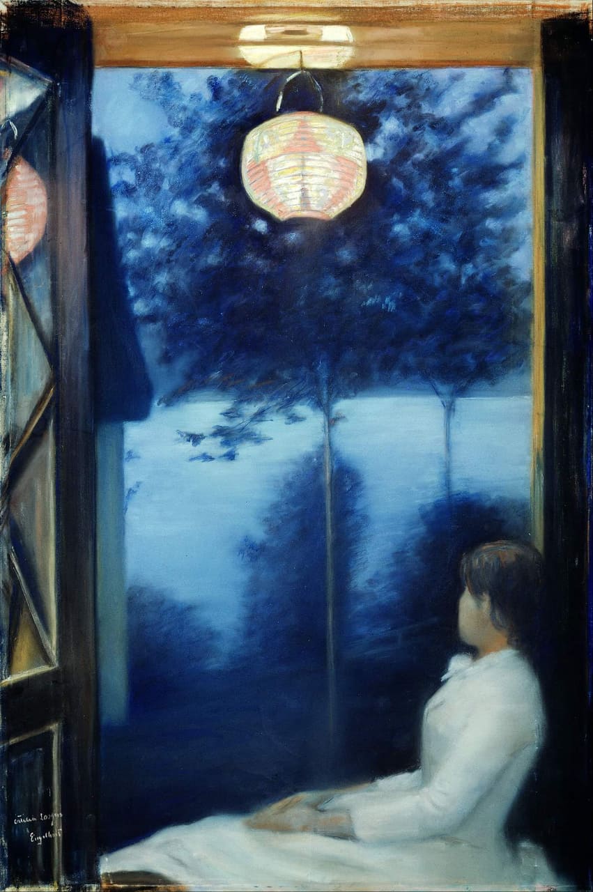
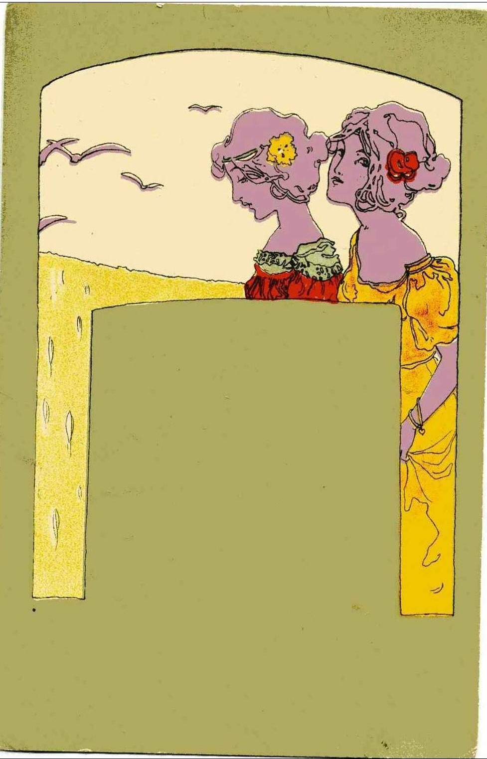
 Picture found here.
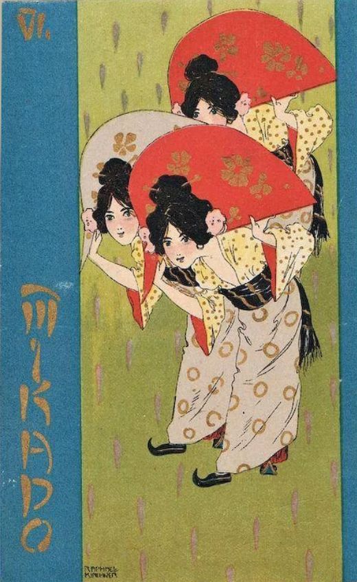
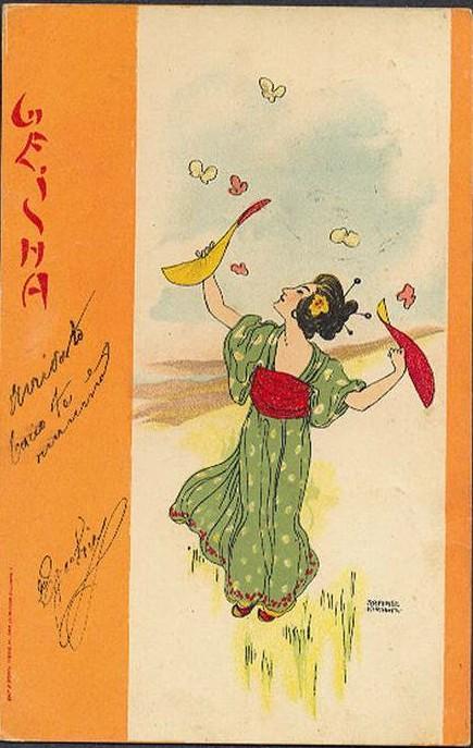
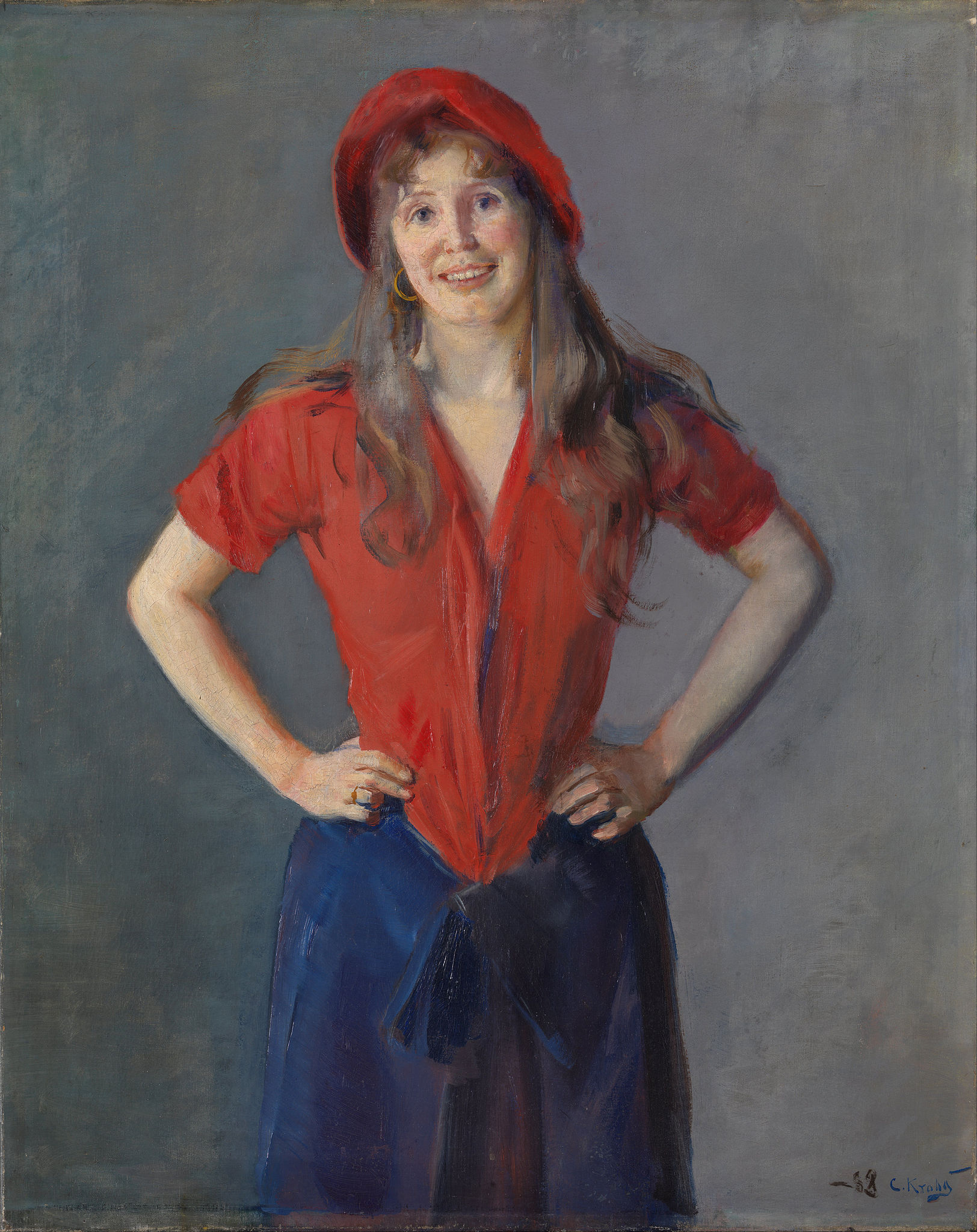
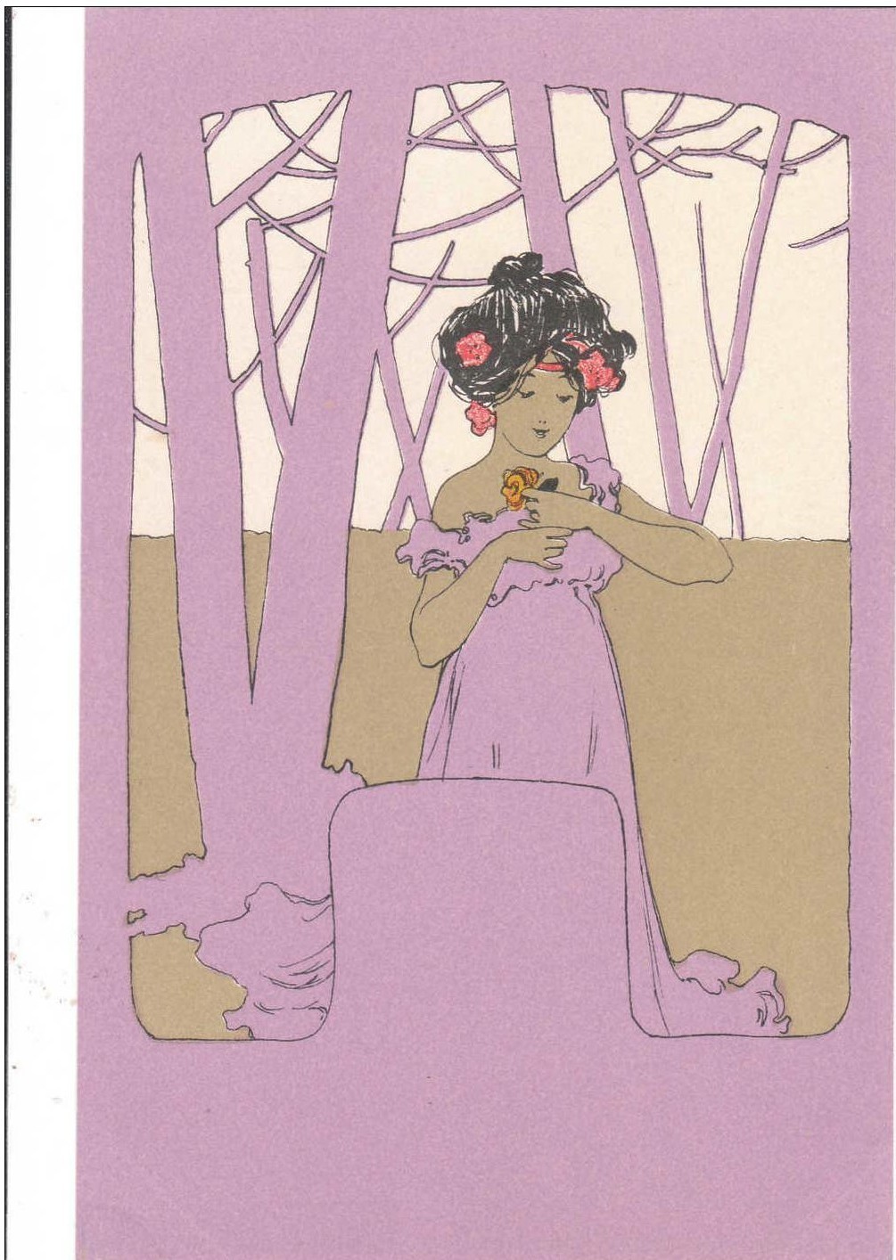


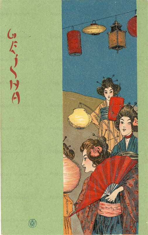
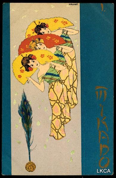
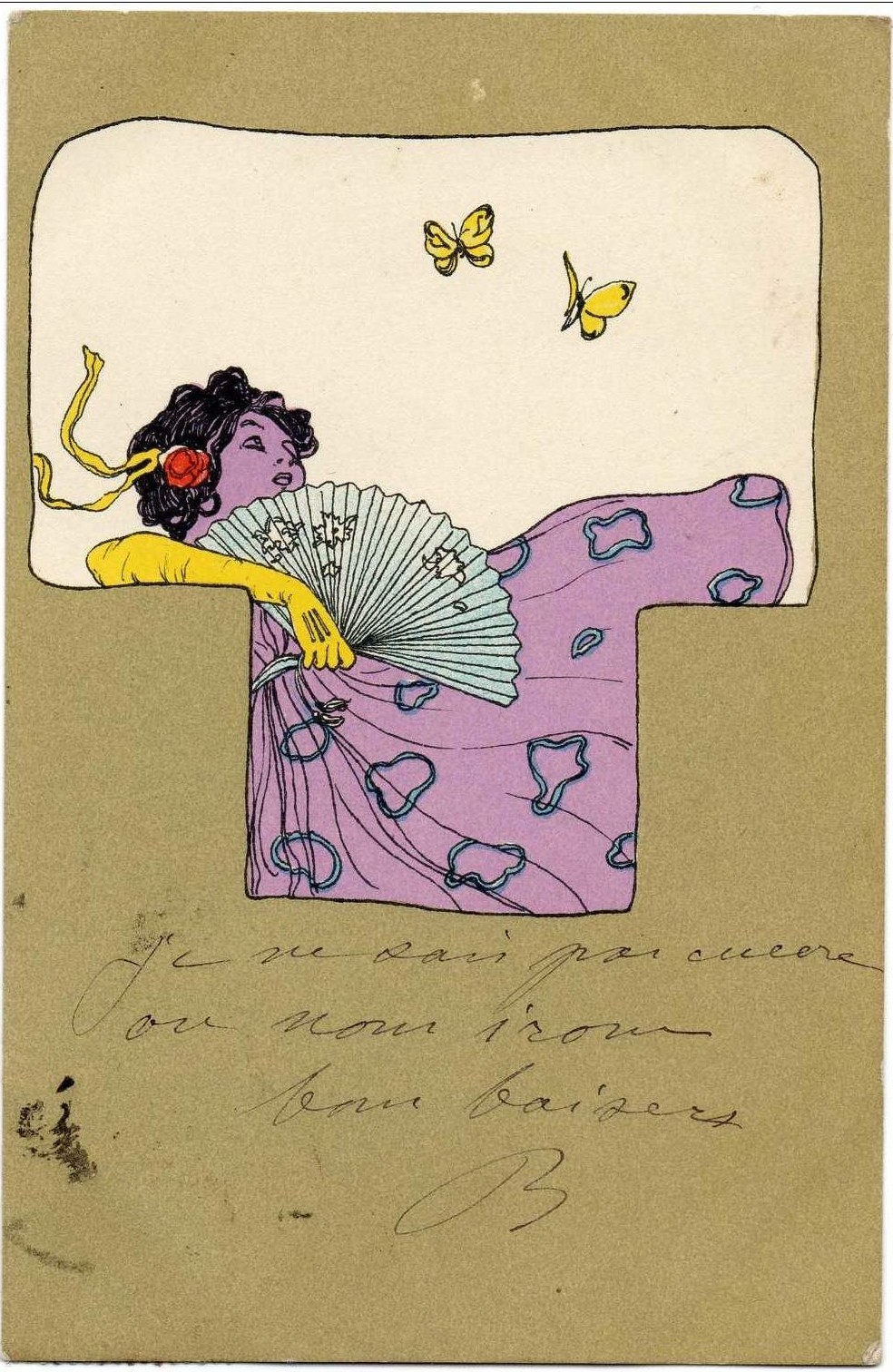
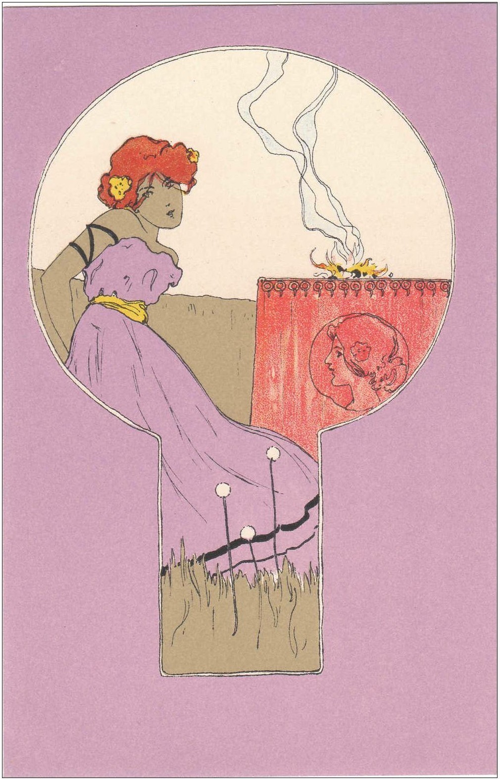
Picture found here.


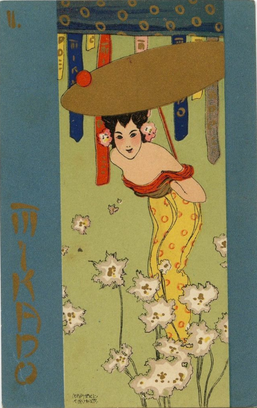
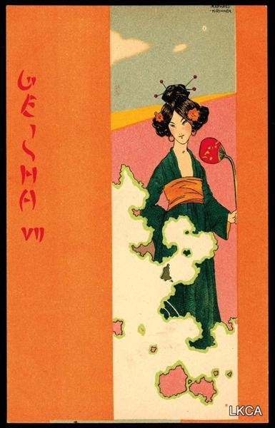
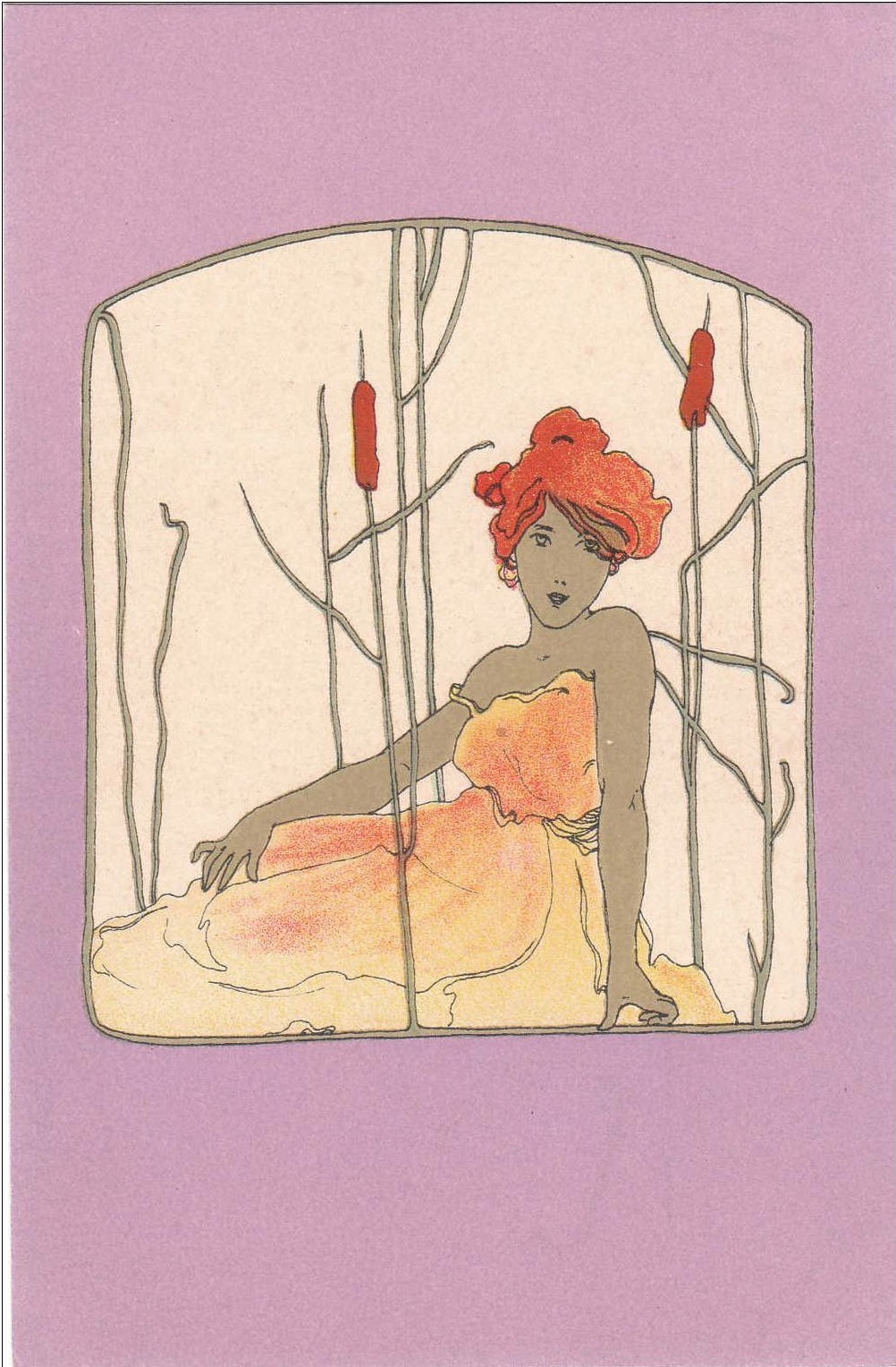
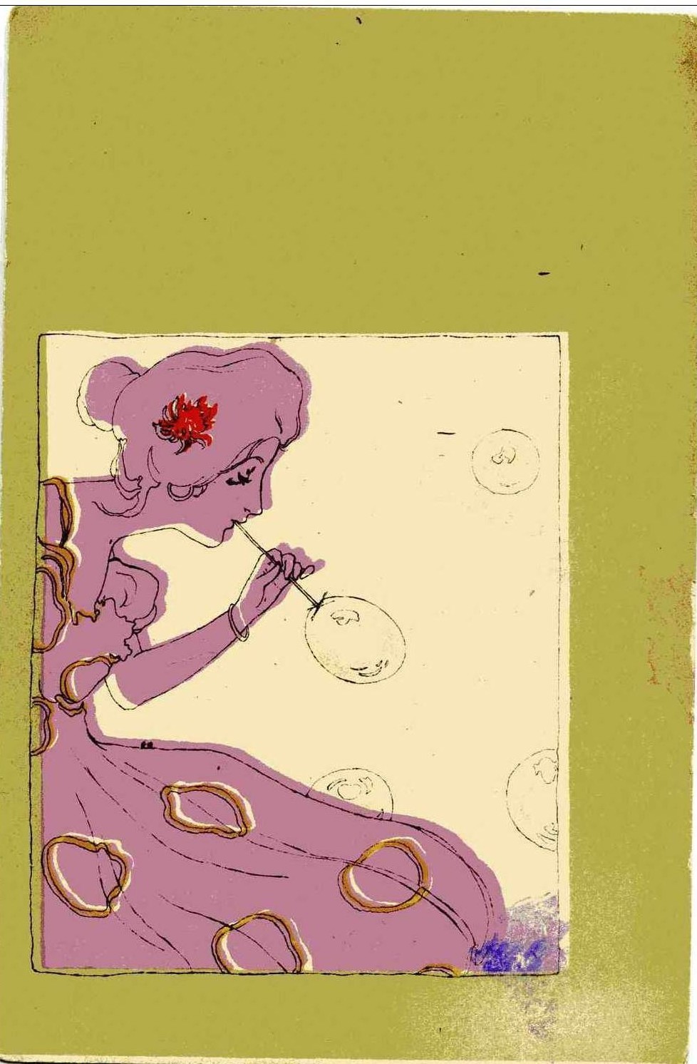
Picture found here.


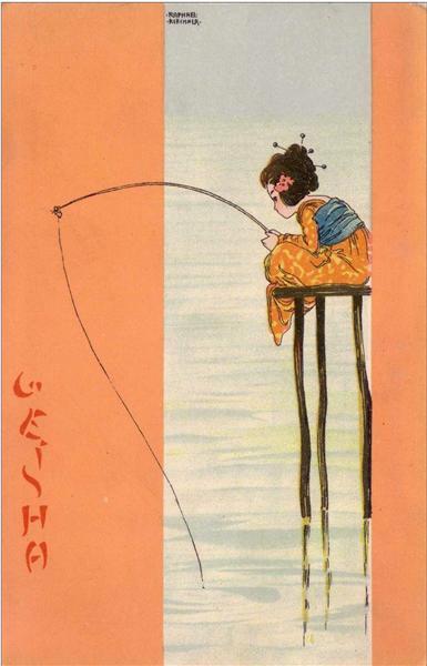
Picture found here.


Picture found here.

Picture by Laura Makabresku.


Two pictures above found on liberty.mai Instagram.

Yayoi Kusama — Self Portrait (collage with pastel, ballpoint pen, and ink on paper, 1972)


Picture found here.


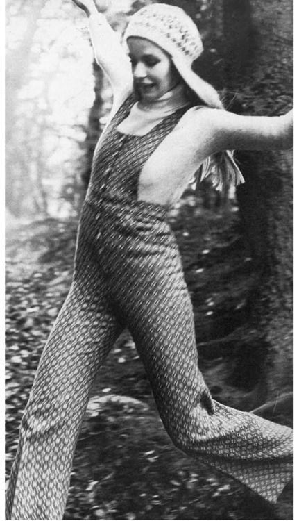
Vogue 1971


there… by Jane Ha