


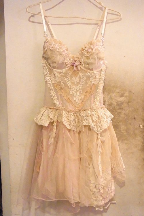
Picture found here.


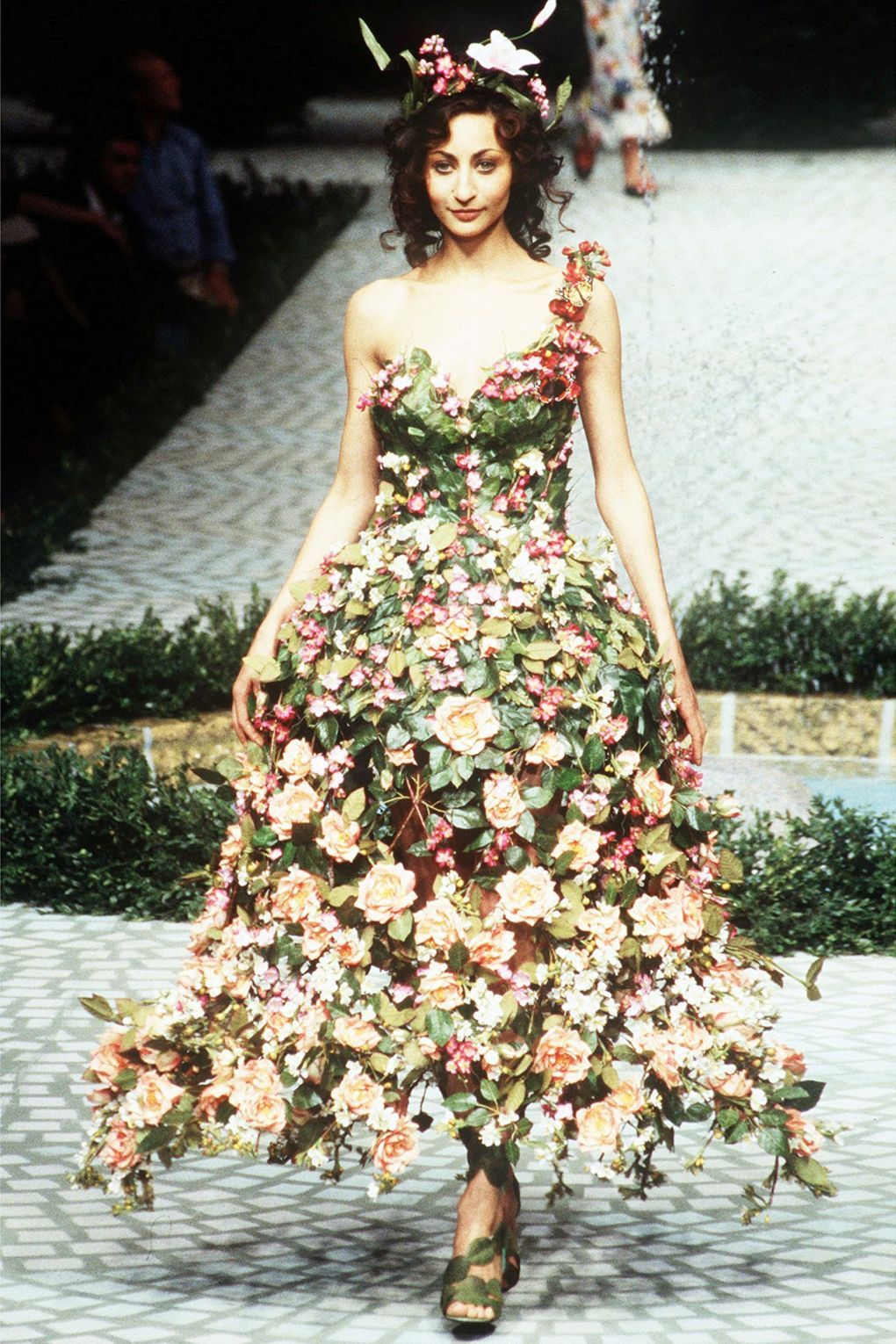
Picture found here.

Picture found here.
Picture found here.

Picture found here.


Picture found here.
“Yes, I deserve a spring–I owe nobody nothing.”
(Virginia Woolf)
 Sonam Kapoor for Harper’s Baazar Bride June 2016.


Sonam Kapoor for Harper’s Baazar Bride June 2016.
“Blossoms at night
And the faces of people
Moved by music.”
(Kobayashi Issa)
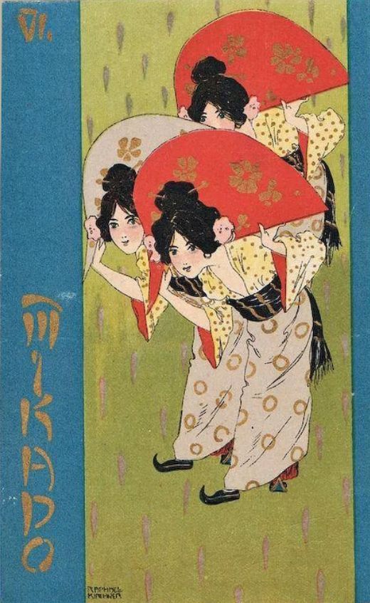
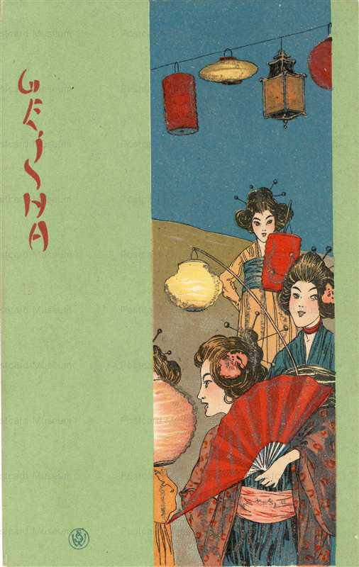
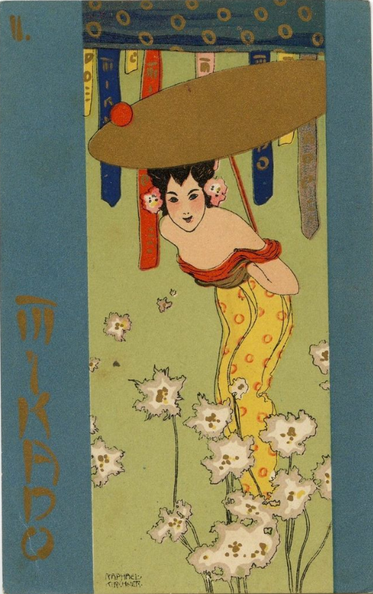
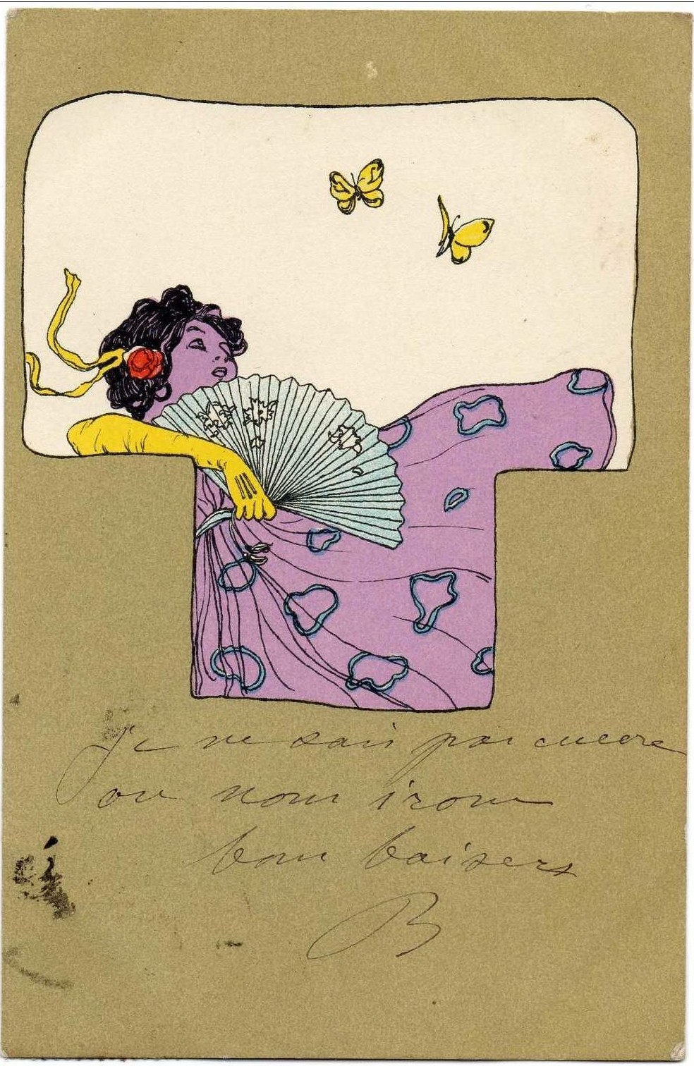
 Raphael Kirchner, Santoy, 1900
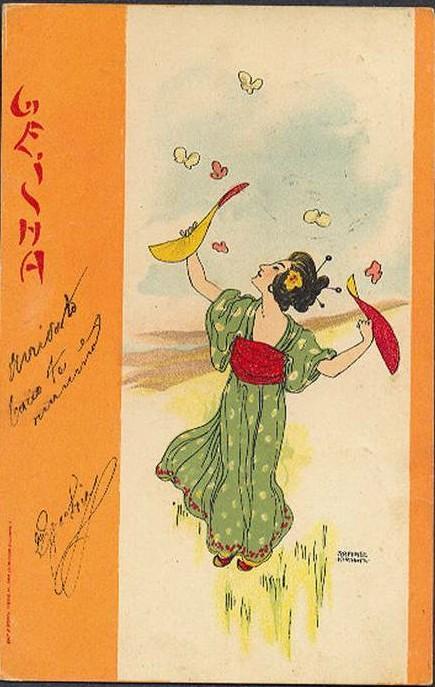
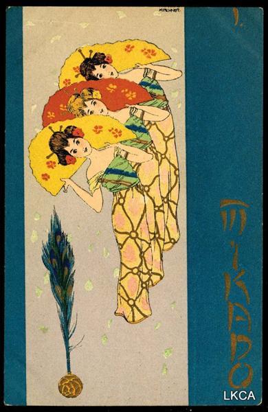
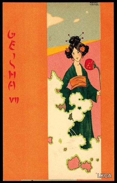
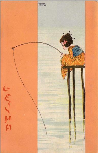
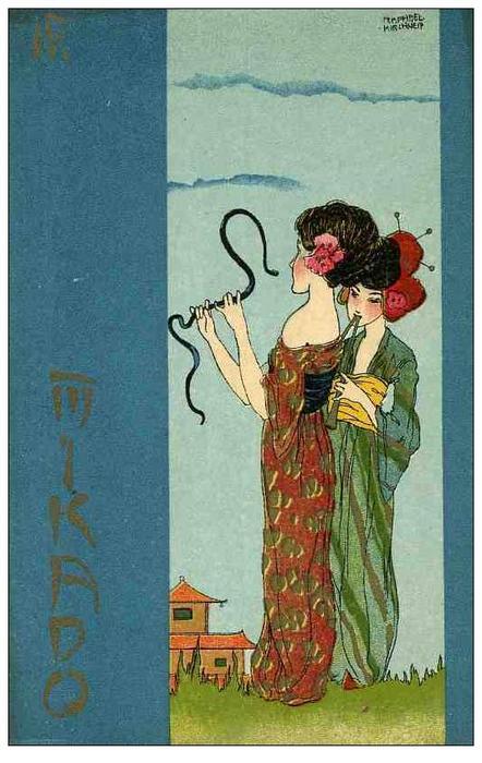
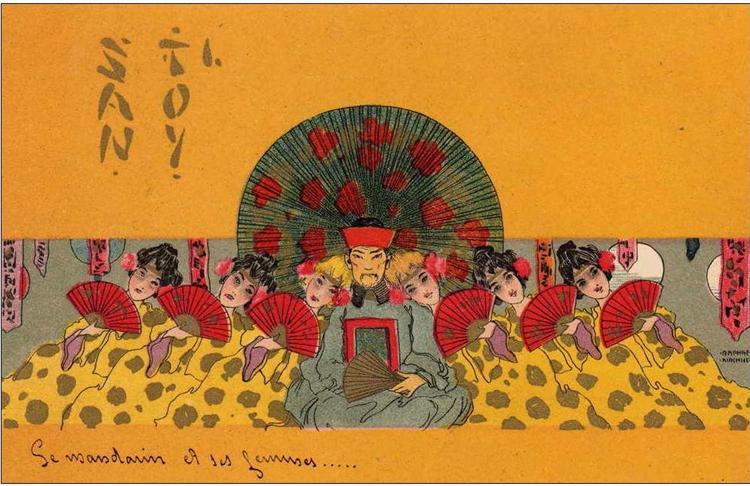
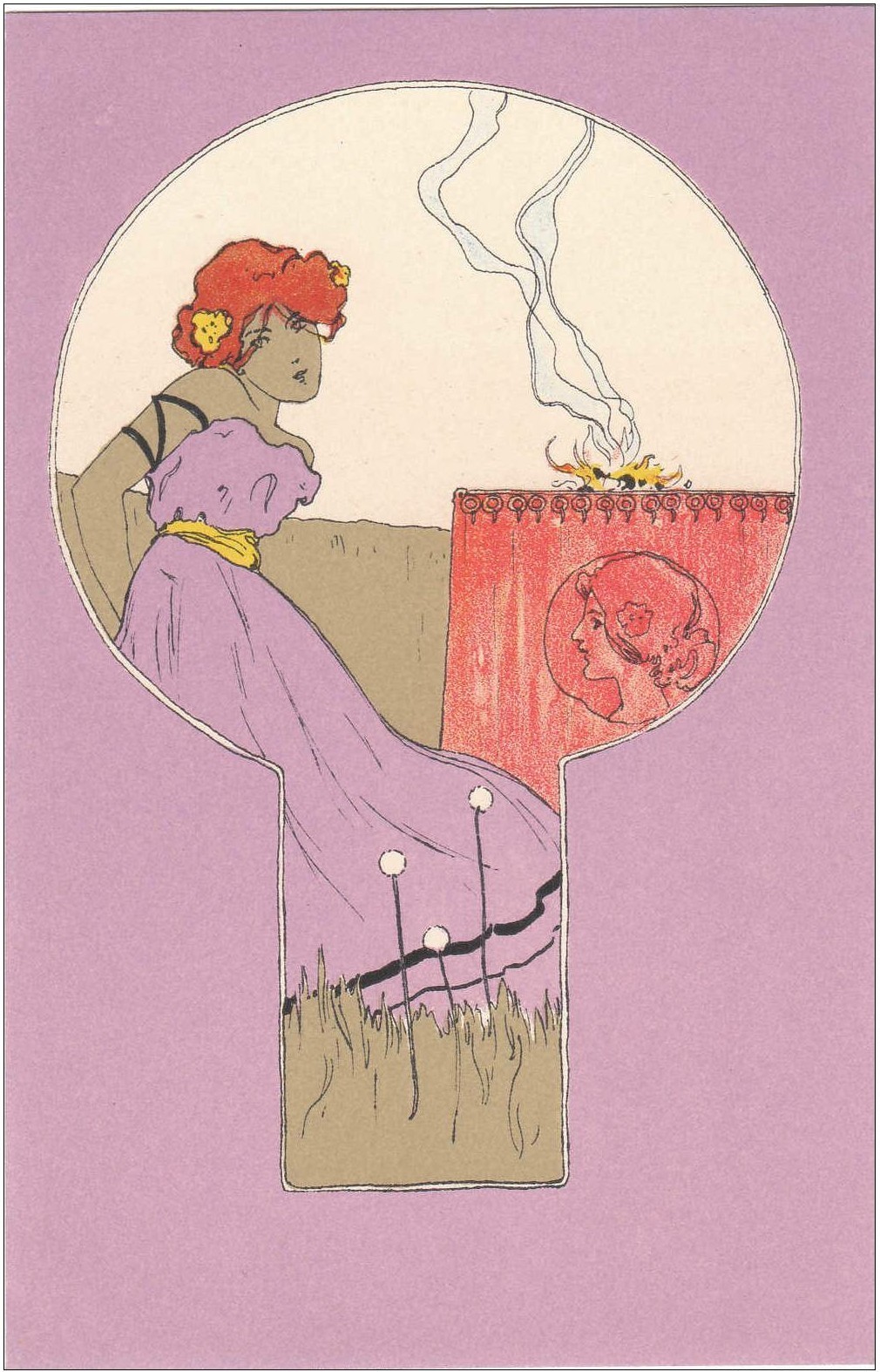
Earlier this month I wrote a post about the elements of Japonisme in Raphael Kirchner’s postcard-illustrations and today I am returning to the topic of Kirchner’s postcards but this time the motif of Japan is even more directly explored. In the postcards featured in my previous post the elements of Japonisme could be seen in many different compositional formats, in the flat surface, the stylised figures and vibrant colour, but in these postcard-illustrations we still have all those stylistic elements taken from Japanese Ukiyo-e prints but now the motives themselves are Japanese with pretty geisha-inspired girls with flowers in their hair, fans, parasols, and the motif of lanterns to set the Oriental tone.
Raphael Kirchner was born in Vienna on 5th May 1875. He took music lessons, attended Conservatoire in Vienna and from 1890 to 1894 he was a student at the Vienna school of Art. He began his art career by painting portraits but quickly switched to making illustrations for magazines and newspapers. In 1897 he started drawing illustrations for a woman’s magazine “Wiener Illustrirte”. In 1900 he moved to Paris, settled in Montmartre and it was during this time that he created the most beautiful, most vibrant and captivating artworks. These illustrations were in fact postcards printed in different series with different motifs; for example the “Perfume” series features pretty La Belle Epoque ladies as allegories for different perfume smells such as patchouli or white rose.
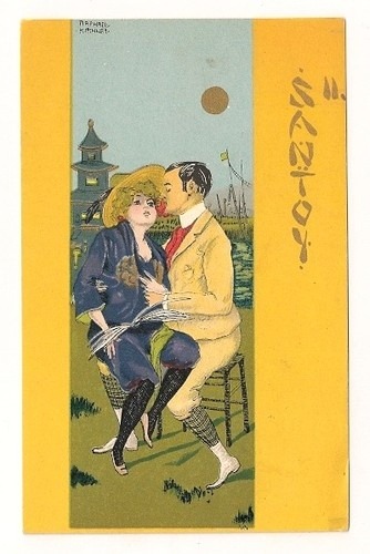
Kirchner made three Japanese inspired series in 1900 called “Geisha”, “Mikado” and “Santoy”. These series of postcards were inspired by the plays of the same name. “The Geisha, a story of a tea house” was an Edwardian musical comedy in two acts which opened in 1896 in Daly’s Theatre in London. “The Mikado; or, The Town of Titipu” was a comic opera in two acts which openend on 14 March 1885 in London at the Savoy Theatre. “San Toy, or the Emperor’s Own” is a musical comedy in two acts first performed on 21 October 1899 at the Daly’s Theatre in London. All three comedies were inspired by the dreams of the distant Orient and were immensely popular with the audiences at the time. Probably my favourite illustration is the one above, from the Santoy series, because it is just so vibrant and exciting! The composition is interesting; it feels as if we are in the middle of the path and on both sides the cascade of pretty faces of pretty girls dressed in colourful printed dresses are gazing at us, smiling, holding their bright yellow lanterns. It brings to mind the joy of warm summer nights with fireflies as the only light and the rich fragrance of roses and jasmine that fills the air. I love the colours used; red, yellow purple; really pleasing to my eyes. Also, in all of these postcards you will notice the ornamental letters “Mikado” or “Geisha” shaped in a way that it looks Oriental and exciting to our Western eyes. The illustration has that festival mood and I found an appropriate little haiku poem that matches its mood, so here it is, by Isabel Caves, found on her wordpress site here:
“Spring lanterns –
colourful reincarnations
of the moon”


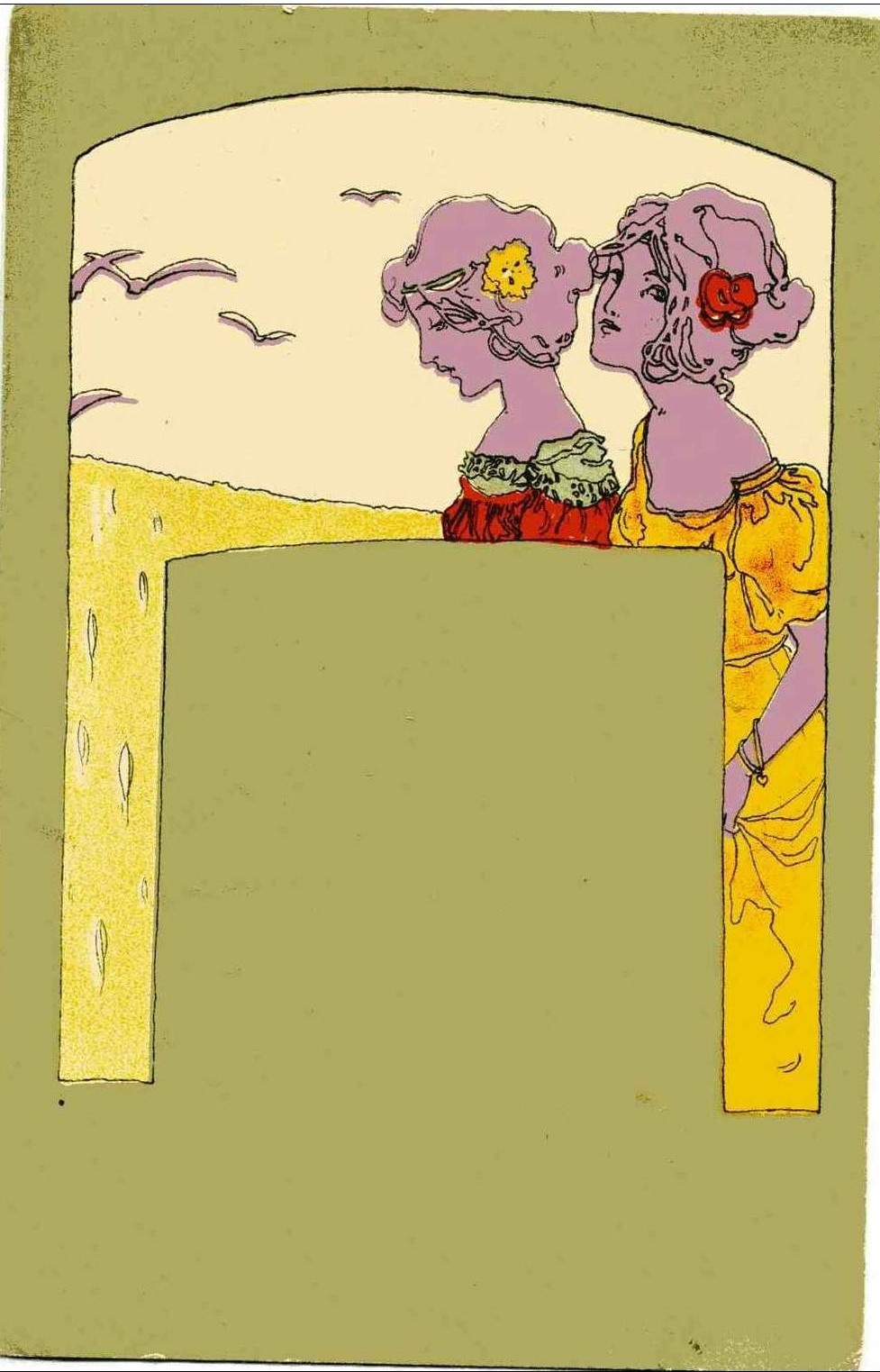
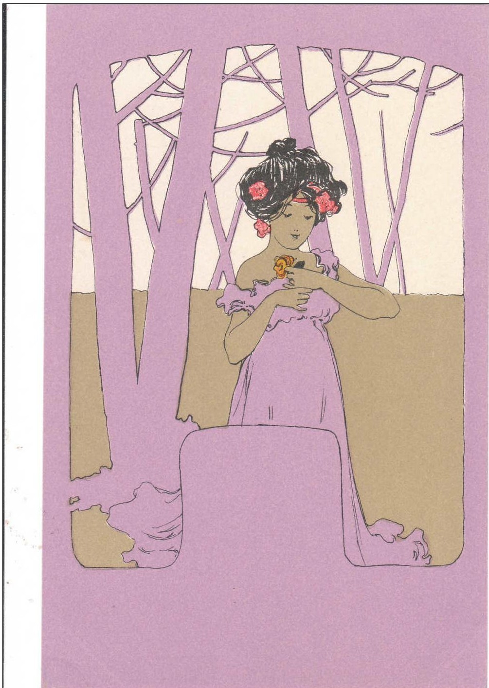
 Raphael Kirchner, Girls with olive green surrounds, 1901
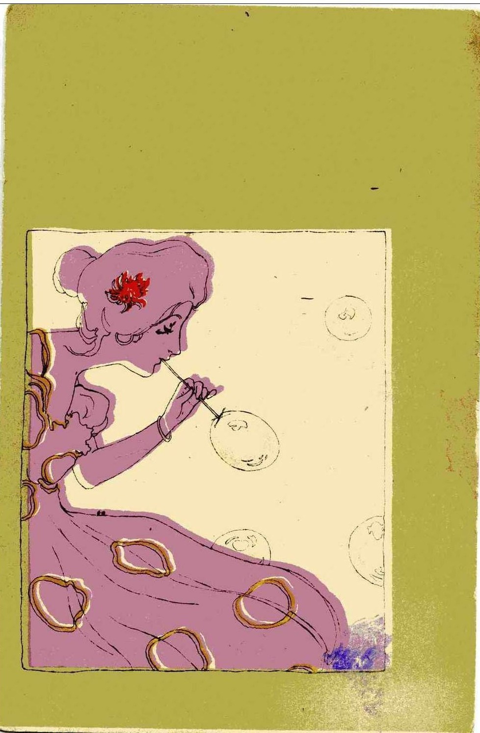
Raphael Kirchner was born in Vienna on 5th May 1875. He took music lesson, attended Conservatoire in Vienna and from 1890 to 1894 he was a student at the Vienna school of Art. He began his art career by painting portraits but quickly switched to making illustrations for magazines and newspapers. In 1897 he started drawing illustrations for a woman’s magazine “Wiener Illustrirte”. In 1900 he moved to Paris, settled in Montmartre and it was during this time that he created the most beautiful, most vibrant and captivating artworks. These illustrations were in fact postcards printed in different series with different motifs; for example the “Perfume” series features pretty La Belle Epoque ladies as allegories for different perfume smells such as patchouli or white rose. Kirchner made series which directly take inspiration from Japanese art, such as his “Geisha” and “Mikado” series, but the artworks that I am presenting here today also take inspiration from Japanese woodblock prints but in a more subtle way. The Oriental design is what drew me to these artworks in the first place. Vibrant colours, flat design, stylised figures; these are all the characteristics that Kirchner found in Japanese art but there is something more: the composite format.
Notice how in each of these artworks one composite format is placed withing another. In the example above a crescent shaped format is within the rectangular shape. Some formats are hard to even put in words, the one bellow looks like a keyhole, for example. This compositional method is referred to as “the contest of framed pictures” (“kibori gakuawase sanzu”) in Ukiyo-e art and it really brings excitement to an otherwise plain artwork. The method was also popular with lacquer box decorations and it was taken over by European artists such as Gauguin and even by the English firm Brown-Westhead, Moore & Co on their designs of ornamental plates. Kirchner adopted Japonisme like many European painters before him, nothing original, but these postcards offer a whole new dimension of Oriental inspired art. I love everything about them; the colours are perfect, the ladies enjoying simple activities such as gazing at the birds or butterflies, picking flowers, blowing bubbles, or watering plants, the simplicity of the design; the less is more is really true for Kirchner’s art. The woman in the postcard bellow; her bright yellow glove, her opened fan, her dress dancing in the wind, and the two yellow butterflies in the sky; just how simple yet how charming this is.
 Stanislaw Wyspiański, Helena and Flowers, 1902
Polish painter, poet, and playwright Stanislaw Wyspiański was a very prolific artist despite his early death in 1907 at the age of thirty-eight. His mother had died of tuberculosis when he was seven, and his father was an alcoholic who was unable to take care of the family, and history repeated itself in Stanislaw’s life because his three young children were left fatherless after he died fairly young. Wyspiański’s paintings and his literary works are both seen as a bridge that succesfully connected the patriotic themes which were so popular in Romanticism and the modernist, Symbolist art currents of his times. His oeuvre mostly consists of portraits of women and girls, and some interesting landscapes. In the portraits of girls there is often an emphasis on the traditional clothing and his wife Teodora Teofila, whom he finally married in 1900, was a peasant herself which shows Wyspiański’s love for Polish countryside and the folkore tradition. His models were often his friends and family, and such is the case in this painting as well. Helena was Wyspiański’s first child and the only daughter, seven year old at the time this delightful painting was painted.
I love everything about this portrait; it is so simple and yet so stunning! Firstly, the vibrant colours. I love colours! The playful red pattern on the sleeve of the girl’s dress, the pink vase and the blue flowers; all these colours are so bubbly and fun and vibrant that the vast darkness of the table ceases to be the focus. Secondly, I love the girl’s face expression and the mood she is in. She is touching the bubble-gum pink vase with the tip of her finger and gazing at it with a calm, almost meditative curiosity. A strand of hair is partly covering her face but we can still see her sweet rosy cheeks. I can imagine Wyspianski gazing at his daughter’s sweet face gazing at the flowers and deciding to capture it in a painting. It also reminded me of a scene from Polanski’s film “Repulsion” (1965) where the shy and detached Carol (played by Catherine Deneuve) is left alone in the flat after her sister goes out on a date and she just sits in the kitchen crying because she feels lonely and left-out and suddenly she sees her reflection in the kettle. It’s an aesthetically interesting moment in the film. Similarly, little Helen here is detached from the outside world and is enamoured by the beauty of the flower pot. Lost in her world of daydreams, little did she know that her father was sketching her. The diagonal composition and the way the flowers are cropped also add to the painting’s appeal. And finally, another thing that I love is the faint reflection of the girl’s face in the surface of the table, what a wonderful little detail that makes the painting so special.
 Vladimir Varlaj, Red House, 1923
A lonely and mysterious pink house with red windows. Tall crooked trees. A passing train. There is an inexplicable loneliness about this autumnal scene which is very captivating to me. The loneliness is combined with vibrant, almost cheerful colours and this combination gives a sense of strangeness, uneasiness even. The contrast confuses and charms both at once. Strangeness is seeping from all sides of this canvas. Even the viewpoint is strange; we are seeing the scene as if we were standing on the hill, above the railway and the house, hidden behind the trees, or maybe we are one of them. The bare crooked trees come alive in the autumn wind, contorting and stretching their thin branches in all directions, their branches are like long arms trying to grab the stars. The soft gradience of the colours, pink mixing with orange and purple, is flying through the canvas from the unknown misty distances to the foreground, and it looks as if the colour is being carried by the wind. Varlaj transformed what might have otherwise been a drab, depressing scene into an almost magical realism landscape which is more a landscape of the soul than that of nature. The ecstatic pink colour is unsettling, like the laugh of a madman. It has the opposite effect than we might expect from dainty color pink. The red windows on the house are a nice contrast against the pink walls, but the place where the doors ought to be are a hollow space that will suck you in if you come too close, like the mouth opened in a scream in Edvard Munch’s painting “The Scream”. And the motif of a train at night passing by without stopping through the strange landscape is perhaps a symbol of the man’s transience, of the passing of life, of the arrival of death.
Vladimir Varlaj (1895-1962) was a Croatian painter and a member of the Group of Four or the Prague Four; the four artists who worked and lived in Prague for a while during and right after the First World War. I have already written about another artist from this group Vilko Gecan here. In 1911 Varlaj started studying in the private school of the Croatian painter and graphic artist Tomislav Krizman, then he studied at the college of Arts and Crafts in Zagreb. In 1915 he was sent to the Russian front and in 1918 he was in Prague. In the 1920s he was back in Croatia, working with passion and eagerness, but sadly, after 1933 he was no longer able to paint because of his illness. The critics and art historians have had a hard time placing Varlaj into a distinct art movement, for his landscapes at times have elements of Expressionism and other times of magical realism. There is an influence of the German New Objectivity painter Alexander Kanoldt whose landscapes had a similar unsetting and strange appeal, but also, without a doubt, Varlaj was painting the state of his soul when he was painting a landscape which is something that the German Romantic Caspar David Friedrich was a big proponent of. Some of Varlaj’s landscapes are more tame, continuing the tradition of Croatian landscapes. But other, such as the “Red House” are more moody and romantic, and filled with visual elements that add to the drama such as the nocturnal setting, lonely house by the railway, a passing train, bare trees; the desolation of late autumn is perfectly encapsulated in this painting, and so is the desolation of the artist’s soul. Varlaj was known for destroying his artworks in moments of depression and disillusionment so we are lucky that this amazing painting survived the painter’s madness.
“The Arlesian sun smote Vincent between the eyes, and broke him wide open. It was a whirling, liquid ball of lemon-yellow fire, shooting across a hard blue sky and filling the air with blinding light. The terrific heat and intense clarity of the air created a new and unfamiliar world.”
(Irving Stone, Lust for Life)
 Vincent Van Gogh, Still Life: Vase with Fourteen Sunflowers, August 1888
One of my greatest joys in these early spring days is noticing and gazing at the trees in bloom, the same trees which were sad-looking and bare for months, and enjoying the golden rays of sun caressing me and promising ever warmer days. The joy of feeling the warm sun on your skin cannot be put in words! When it comes to art, my mind instantly went to Vincent van Gogh’s sunflowers, his delicate almond blossoms and blooming orchards, I need his yellows and blues like I need the air to breathe. I was reading some of his letter again and also I was rereading Irving Stone’s wonderful novel “Lust for Life”, first published in 1934, which is a romanticised biography of Vincent van Gogh. I really recommend the book to everyone because it’s just so beautifully written and it absolutely sweeps you away. Irving Stone was just a great writer, I also read his novel “Agony and Ecstasy” about the life of Michelangelo, and I loved it as well, and I am not even interested in the art of Michelangelo and I think that speaks for the brilliancy of Stone’s writing. So, I decided to share passages from the novel which I found particularly interesting and accompany it with Van Gogh’s paintings and my own thoughts. After spending some time in Paris and living with his brother, Vincent, a man from the drab north, felt an inexplicable aching and longing for sun and in spring of 1888 he arrived to Arles, a small town in Provence, and that is where some of his most exciting, most vibrant paintings were painted. Here is how his arrival and first impressions of Arles are described in “Lust for Life”:
“He dropped out of the third-class carriage early in the morning and walked down the winding road that led from the station to the Place Lamartine, a market square bounded on one side by the embankment of the Rhône, on the other by cafés and wretched hotels. Arles lay straight ahead, pasted against the side of a hill with a neat mason’s trowel, drowsing in the hot, tropical sun. When it came to looking for a place to live, Vincent was indifferent. He walked into the first hotel he passed in the Place, the Hotel de la Gare, and rented a room. It contained a blatant brass bed, a cracked pitcher in a washbowl, and an odd chair. The proprietor brought in an unpainted table. There was no room to set up an easel, but Vincent meant to paint out of doors all day.
He threw his valise on the bed and dashed out to see the town. There were two approaches to the heart of Arles from the Place Lamartine. The circular road on the left was for wagons; it skirted the edge of the town and wound slowly to the top of the hill, passing the old Roman forum and amphitheatre on the way. Vincent took the more direct approach, which led through a labyrinth of narrow cobblestone streets. After a long climb he reached the sun scorched Place de la Mairie. On the way up he passed cold stone courts and quadrangles which looked as though they had come down untouched from the early Roman days. In order to keep out the maddening sun, the alleys had been made so narrow that Vincent could touch both rows of houses with outstretched fingertips. To avoid the torturing mistral, the streets wound about in a hopeless maze on the side of the hill, never going straight for more than ten yards. There was refuse in the streets, dirty children in the doorways, and over everything a sinister, hunted aspect.

Vincent van Gogh, Peach Tree in Blossom, Arles, April-May 1888
Vincent left the Place de la Mairie, walked through a short alley to the main marketing road at the back of the town, strolled through the little park, and then stumbled down the hill to the Roman arena. He leaped from tier to tier like a goat, finally reaching the top. He sat on a block of stone, dangled his legs over a sheer drop of hundreds of feet, lit his pipe, and surveyed the domain of which he had appointed himself lord and master.
The town below him flowed down abruptly to the Rhône like a kaleidoscopic waterfall. The roofs of the houses were fitted into each other in an intricate design. They had all been tiled in what was originally red clay, but the burning, incessant sun had baked them to a maze of every colour, from the lightest lemon and delicate shell pink to a biting lavender and earthy loam-brown.
The wide, rapidly flowing Rhône made a sharp curve at the bottom of the hill on which Arles was plastered, and shot downward to the Mediterranean. There were stone embankments on either side of the river. Trinquetaille glistened like a painted city on the other bank. Behind Vincent were the mountains, huge ranges sticking upward into the clear white light. Spread out before him was a panorama of tilled fields, of orchards in blossom, the rising mound of Montmajour, fertile valleys ploughed into thousands of deep furrows, all converging at some distant point in infinity.

Vincent van Gogh, Blossoming Almond Branch in a Glass, 1888
But it was the colour of the country-side that made him run a hand over his bewildered eyes. The sky was so intensely blue, such a hard, relentless, profound blue that it was not blue at all; it was utterly colorless. The green of the fields that stretched below him was the essence of the colour green, gone mad. The burning lemon-yellow of the sun, the blood-red of the soil, the crying whiteness of the lone cloud over Montmajour, the ever reborn rose of the orchards… such colourings were incredible. How could he paint them? How could he ever make anyone believe that they existed, even if he could transfer them to his palette? Lemon, blue, green, red, rose; nature run rampant in five torturing shades of expression.
Vincent took the wagon road to the Place Lamartine, grabbed up his easel, paints, and canvas and struck out along the Rhône. Almond trees were beginning to flower everywhere. The glistening white glare of the sun on the water sent stabs of pain into his eyes. He had left his hat in the hotel. The sun burned through the red of his hair, sucked out all the cold of Paris, all the fatigue, discouragement, and satiety with which city life had glutted his soul.
A kilometre down the river he found a drawbridge with a little cart going over it, outlined against a blue sky. The river was as blue as a well, the banks orange, coloured with green grass. A group of washerwomen in smocks and many-coloured caps were pounding dirty clothes in the shade of a lone tree. Vincent set up his easel, drew a long breath, and shut his eyes. No man could catch such colourings with his eyes open. There fell away from him Seurat’s talk about scientific pointillism, Gauguin’s harangues about primitive decorativeness, Cezanne’s appearances beneath solid surfaces, Lautrec’s lines of colour and lines of splenetic hatred.“
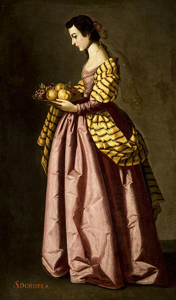
 Francisco de Zurbarán, Saint Agatha, 1630-33
In the first half of the seventeenth century Francisco de Zurbarán, perhaps the spookiest painter of the Spanish Baroque, painted a series of portraits depicting female saints and virgin martyrs which is surprisingly vibrant in colour and mood, at least compared to his other paintings. Zurbarán painted around twenty such portraits and all of them present the image of youth and delicate beauty: the saints are painted as rosy-cheeked girls, elegant and serene, and most importantly – beautifully dressed in sumptuous fabric in all colours and shade, from mustard yellow and rich red to greens, blues and even some splendid Veronese pink. In his time Zurbarán got his fair share of criticism for portraying the virgin martyrs in such a lavish way, accentuating more their worldly beauty and rich attire rather than their humility and piousness. And indeed, they look more like dainty princesses than martyrs. Still, there is something that clearly marks them as saints and not princesses: their attributes; a visual symbol that helps us recognise which saints is presented in the painting. Our sweet little saint Agatha here is painted carrying her cut off breasts on a platter and that is how we know the painting shows Saint Agatha and not some other saint.
Agatha of Sicily (c. 231-251) was an early Christian saint born in Sicily and the story goes that, according to Jacobus de Voragine’s “Golden Legend”, the young Agatha took a virginity vow and, on many occasions, rejected the romantic offers of Roman prefect Quintianus. This all happened during the persecutions of Decius and eventually Quintianus reported Agatha to the authorities. He imagined that Agatha, when faced with torture and death, would give in to his demands, but instead she prayed to god for courage. Part of her torture included her breasts being cut off with pincers. She was suppose to be burnt at the stake but an earthquake prevented this and then she was sent to prison where St Peter the Apostle appeared to her and healed her wounds. She died in prison, remaining faithful to her ideals.
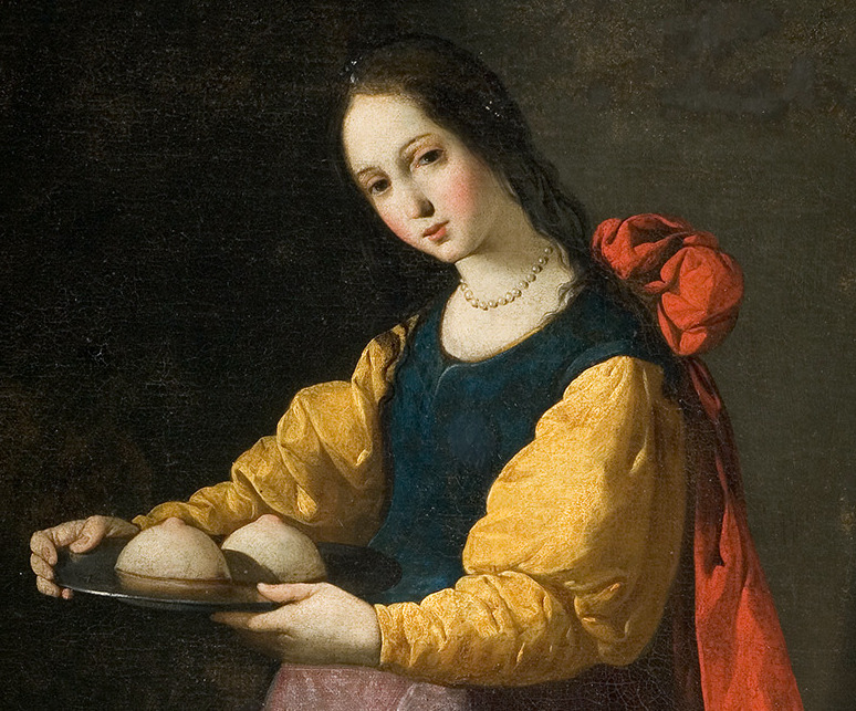
In Zurbarán’s portrait, not a trace of suffering, torment or pain can be seen on her delicate pale face, only perhaps a tinge of wistfulness. Her slender figure is arising from the darkness of the background like a beautiful sculpture and there is nothing in the painting that distracts us from the real motif: Saint Agatha. She’s gazing in the distance with her large dark eyes while her breasts, so pale and so beautifully sculpted, stand on the platter like two delicious cupcakes. Around her neck a pearl necklace, her dress falling beautifully. I like other female saints portraits as well but Agatha showing off her cut off breasts is perhaps the most interesting to me because it’s kinda provocative and naughty. Just imagine what an outrage these tits would cause if the theme of the painting wasn’t religious but worldly. Here are some other paintings from the same series:
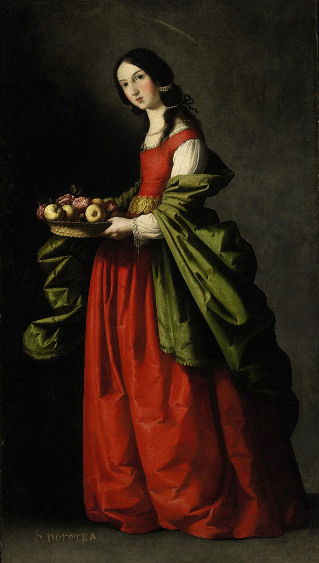
Francisco de Zurbarán, Santa Dorotea, 1648
Francisco de Zurbarán, Saint Dorothy, 1640-50
Francisco de Zurbarán, Saint Ursula, 1635-40
 Der Himmel über Berlin
Wim Wenders’ film “Wings of Desire” (Der Himmel über Berlin, 1987) perfectly encapsulated my vision of circus. It is a beautiful film, one of my all time favourites, and even though the circus is not its main theme, it is the most poignant to me. What’s not to like about this film; slow tempo, alienating mood, greyness of Berlin streets and buildings, everyday sadness that seems poetic seen through the eyes of the Angel, old man vainly looking for Potsdamer Platz but finding only the wall covered in graffiti, depressed people in U-Bahns, a sad young man who commits suicide by jumping from the top of the Europa Centar at Kudamm thinking to himself “The East is everywhere”, Nick Cave and the Bad Seeds having a gig at a smoky club, also The Crime and the City Solution, and finally – the lonely trapeze artist Marion who “waited an eternity to hear a loving word”. The most beautiful scene in the film, for me (you can see it on YouTube) is when Marion sits on top of the car, wistful and lonely, with her angel wings, thinking about past and future because the circus, an elephant sadly trumpets, and the guy starts playing a sad melody on accordion. So beautiful, dreamy and nostalgic.

 Der Himmel über Berlin
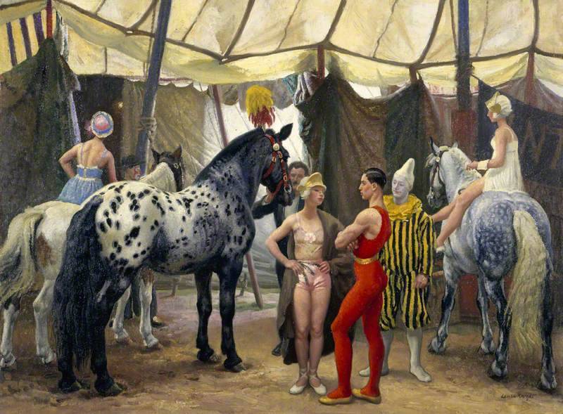
There’s this duality of circus that intoxicates me. Everything is an illusion, just like in cabarets, theatres, nightclubs, parties, Moulin Rouge etc. On one hand, there’s the cheerful vibrancy; striped red-white tent, trapeze artist in shiny pink costume, wide smiled doing acrobatics, laughter and clapping, clowns, tightrope walkers, jugglers, dancers, magicians, animals, lions, crocodiles, elephants, trained to do tricks against their will. On the other hand, there’s the grey reality after the performance. These artists seem to live for the show, but about life after it? Exhausted people returning to their trailors, doing the same thing every night to a different crowd, from one town to the next. When the audience finally leaves, when the candy-floss and popcorn have been sold, when silent night descends, what remains – solitude and melancholy.
There’s such sadness and transience in seeing posters all over the town for an event that has passed becoming paler, chipped and torn as each day passes until one day, a new set of shiny bright posters replace them. Circus theme is present in the film Coralina (2009) where the old Russian guy in the attic perseveres in teaching mice to do tricks; in reality he fails to do so, but in the “other world” his circus is the stuff that dreams are made of. In Milan Kundera’s novel “The Unbearable Lightness of Being”, Sabina is a painter and the scenes she paints always have a duality about them; red velvet curtains that reveal a different whimsical world. There’s always this duality about circus and theatre; glitter and sadness, tears and laughter, ecstasy and melancholy, all tangled together, inseparable.
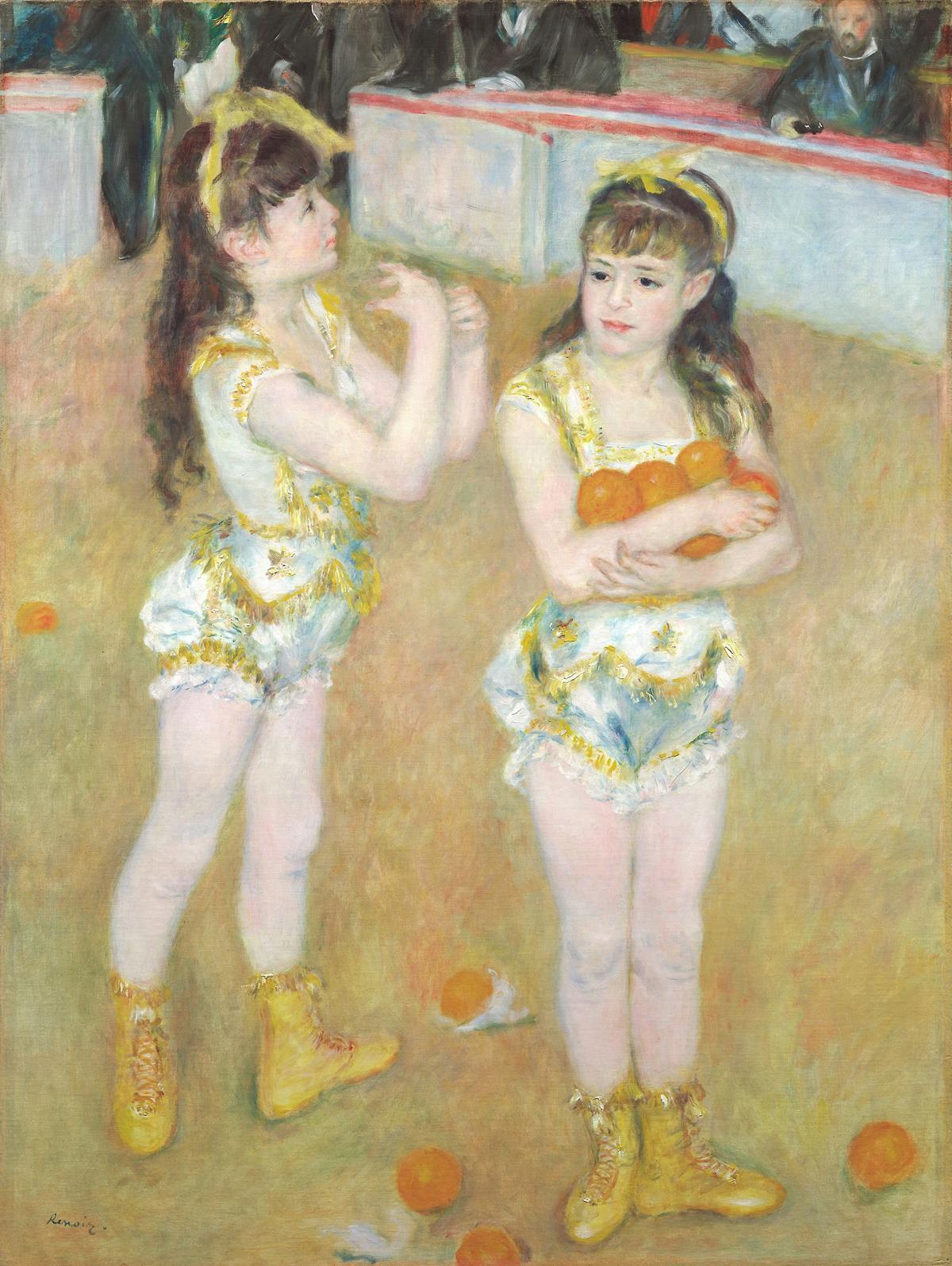
Pierre-Auguste-Renoir, Acrobats at the Cirque Fernando (Francisca and Angelina Wartenberg), 1879
It is easy to understand why all those painters were drawn to the fanciful world of circus, theatre and the clowns, from Antoine Watteau who portrayed the sad, melancholy Pierrot in the most humane, poignant way, to Goya, Picasso, Renoir, Seurat, Federico Beltran Masses, Marc Chagall, Henri Toulouse-Lautrec, Laura Knight and many others. Firstly, the circus was a visually fascinating place, all the vibrant colours, interesting faces and shining costumes, dynamic and the movement are so easy to capture on paper, you needn’t search for a particular motif, it is right there in front of your eyes, paint a clown or a trapeze artist. Secondly, circus performers were people alienated from the rest of the “normal” society and that makes them similar to painters from Montmarte and Montparnasse. They both had the outsider appeal which drew them together, they both felt all too well the fragility and beauty of living on the margins of society. And thirdly, a painter paints a world of his own on his canvases and a circus is already a world of its own; Marc Chagall’s art is really unique in how playful and imaginative it is, we can really call it “Chagall’s world” because it doesn’t exist anywhere else but on his canvases (and first in his mind, naturally) and likewise, the world of circus only exists under the striped red and white tent, only on specific days, in certain evening hours, so it is like a dream, and dreams always end. I will not comment specifically about each painting, but I hope you enjoy this little selection of circus scenes in art which I love.
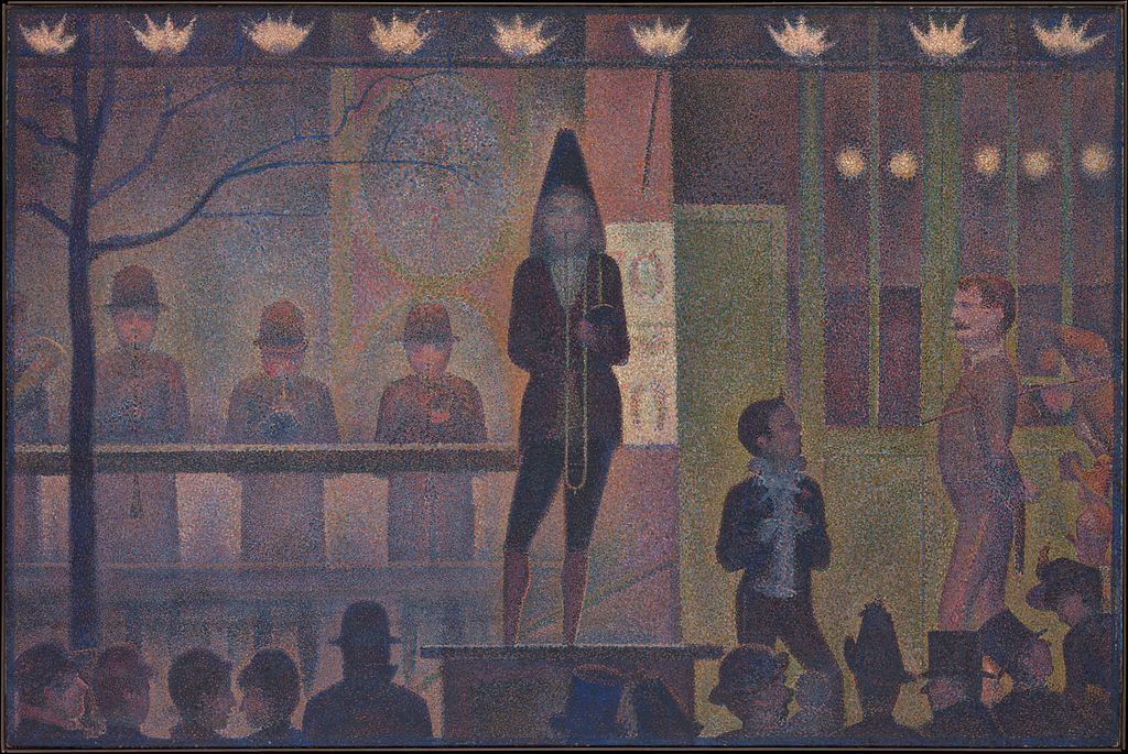
Georges Seurat, English Circus Sideshow, 1887-88
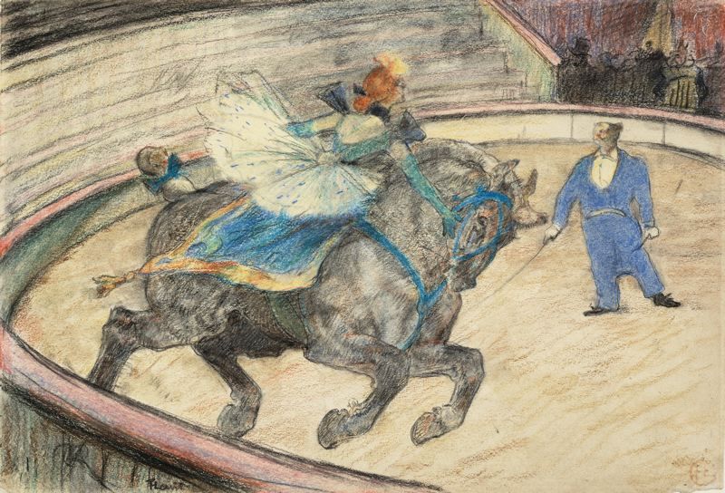
 Henri de Toulouse-Lautrec, Rider On A White Horse, 1888, pastel and gouache
 Henri de Toulouse-Lautrec, At the Circus Fernando, the rider, 1888
Henri Toulouse-Lautrec, At the circus work in the ring, 1899
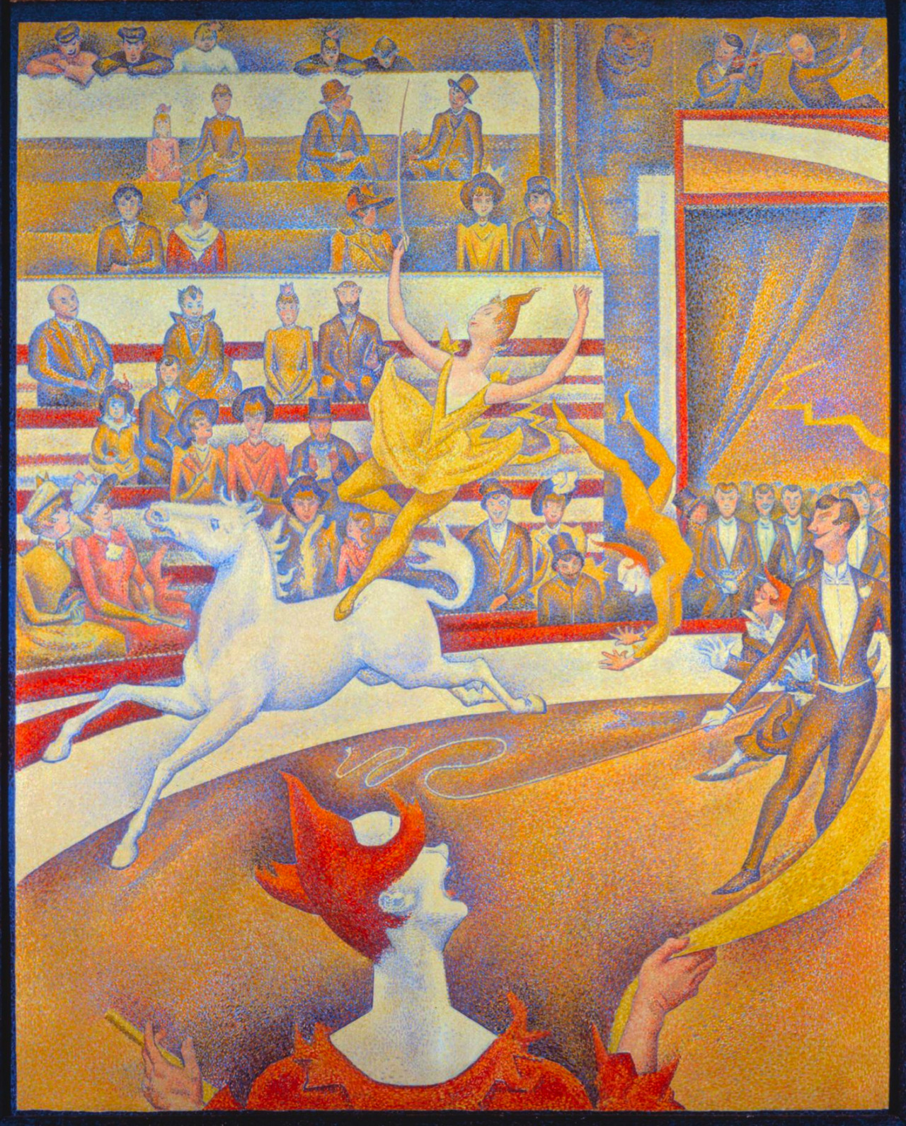
Georges Seurat, The Circus, 1891
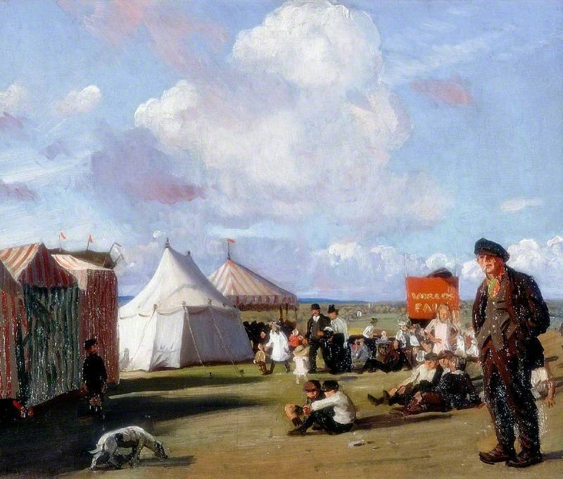 Laura Knight, The Fair, 1919
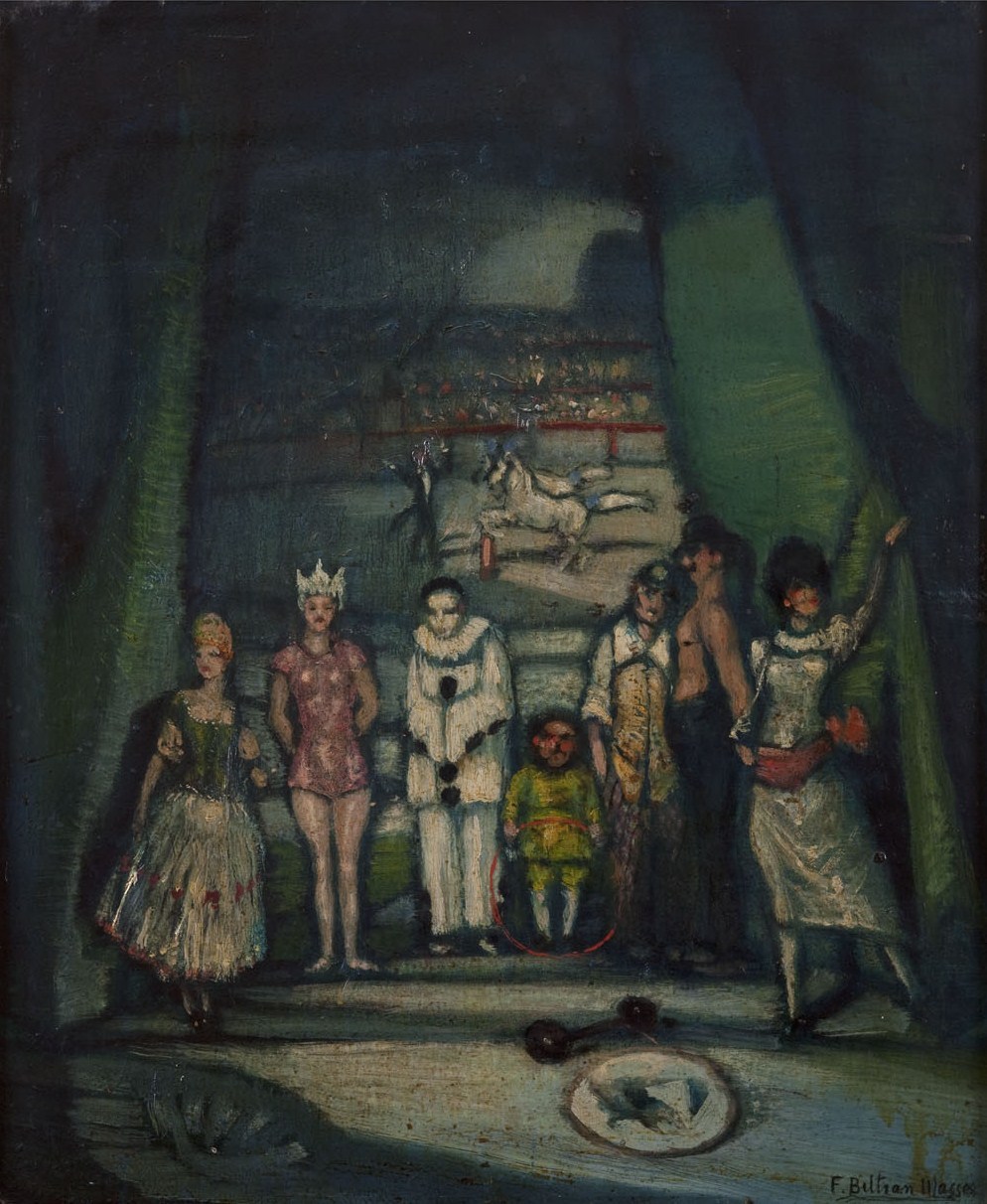
Federico Beltran Massess, Circus (El Circo), c. 1920s
Laura Knight, Circus Matinee, 1938
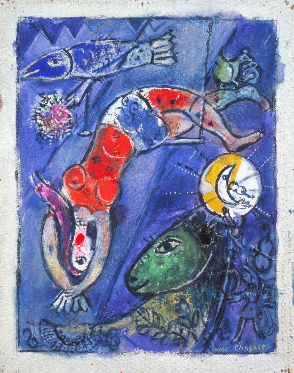
Marc Chagall, The Blue Circus, 1950
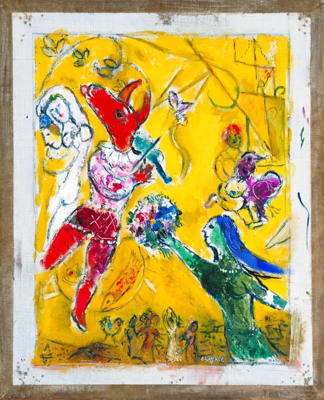
Marc Chagall, The Dance and the Circus, 1950
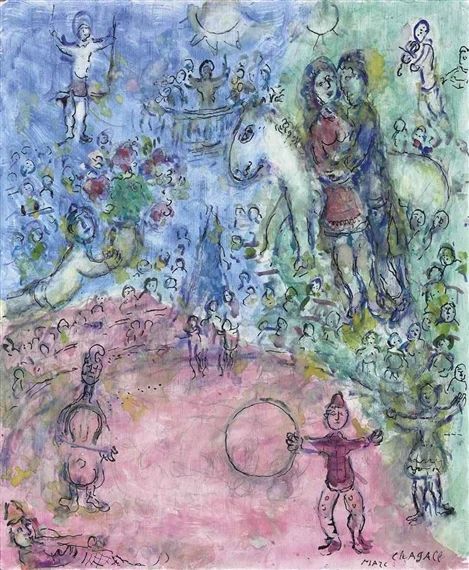
Marc Chagall, Couple au cirque 1981
“The voice of the sea is seductive; never ceasing, whispering, clamoring, murmuring, inviting the soul to wander for a spell in abysses of solitude; to lose itself in mazes of inward contemplation. The voice of the sea speaks to the soul. The touch of the sea is sensuous, enfolding the body in its soft, close embrace.”
(KIate Chopin, The Awakening)
 Philip Wilson Steer, Boulogne Sands, 1888-91
Philip Wilson Steer painted some rather dull landscapes and some very atmospheric interiors with dreamy girls, but his most unique and eye-catching paintings are these vivacious and vibrant beach scenes painted in the late 1880s and first half of the 1890s. The radiant colours and the sketchy style is what makes these paintings so unique and extraordinary.
At the age of eighteen, Steer wished to work for the Civil Service but found the entrance exams too demanding. We are fortunate that didn’t occur, for he probably would not have become a painter. He proceeded to study at the Gloucester School of Art and Kensington Drawing Schools, but he wasn’t quite good enough for the Royal Academy of Art. After being rejected by the Academy, Steer went to Paris and there he studied from 1882 to 1884, first at the Academie Julian and then at the École des Beaux Arts where his teacher was Alexandre Cabanel. Despite the years spent at the academies, Steer returned to England not as a Cabanel copy-cat, rather he was more influenced by the works of the Impressionists that he had seen. Steer often visited the picturesque coastal little towns of Walberwick and Southwald in Suffolk, for he had friends there, and he painted people, mostly mothers and daughters, having their holidays in the sun. Despite being inspired by the Impressionist, Steer didn’t go full plein air, that is, he didn’t paint outdoors. Whilst on the beach, Steer would enjoy the scenery and liveliness all around him, take many sketches in his sketchbook and then later turn them into proper paintings in his studio. That way he could capture many fun scenes that happened on the beach in the same day and transform them into canvases full of dots, dashes, textures, sketchy imprecise and harsh brushstrokes.

Philip Wilson Steer, Watching Cowes Regatta, 1892
These beach scenes may appear sketchy and spontaneous, but Steer actually carefully planned each one and often took years to finish them. Each of them has a unique beauty; “Watching Cowes Regatta” has a wonderfully serene harmony of gentle blue tones and is reminiscent of some of Whistler’s paintings, in “Children Paddling” the water just shines and glimmers and the blueness is overwhelming, in “Girls Running” the two figures of girls dressed in matching dresses and matching red sashes is the most striking, and notice how they are not holding their hands, but their shadows are, in “Figures at the Beach” everything disappears in a blueish haze and the three girls in blue and white dresses are as sketchy as can be to still look recognisable, in “The Beach at Walberswick” the red is so intense and pulsating and contrasts beautifully with the blueness of the sea, and in the last painting what strikes me the most is how sketchy and nearly see-through the figures in the foreground are. A wonderful brushwork and a wonderful vibrancy of shades and colours constrasts truly make these beach scenes tangible and alive; one can hear the waves, the seagulls and the laughter of all these girls, feel the magic of the glimmering sea and feel the pebbles or sand underfoot.
“There were days when she was very happy without knowing why. She was happy to be alive and breathing, when her whole being seemed to be one with the sunlight, the color, the odors, the luxuriant warmth of some perfect Southern day. She liked then to wander alone into strange and unfamiliar places. She discovered many a sunny, sleepy corner, fashioned to dream in. And she found it good to dream and to be alone and unmolested.” (Kate Chopin, The Awakening)

Philip Wilson Steer, Walberswick, Children Paddling, 1894

Philip Wilson Steer, Girls Running, Walberswick Pier, 1888-94

Philip Wilson Steer, Figures on the Beach, Walberswick, 1888-89

Philip Wilson Steer, The Beach at Walberswick, 1889

Philip Wilson Steer, Southwold, 1889


