Tag Archives: red

Claude Monet – The Red Cape (Madame Monet or The Red Kerchief)

29 Jan

Claude Monet, The Red Cape (Madame Monet or The Red Kerchief), 1868

Claude Monet’s painting “The Red Cape” was painted in 1868 while the artist was living in Argenteuil. The painting might at first as yet another Impressionist interior scene, but it is actually a beautiful portrait of Monet’s first wife Camille. I love how indirect it is; the model is outside while the painter is inside and we are seeing her through the window. Camille’s red cape is the first thing that catches our eye. The intense red colour breaks the monotony of whites and greys. In a winter fairytale a ripe, blooming carnation. The trees and the snow outside are captured in patches of colour, in a typical Impressionist manner. Everything is very soft and vague. Camille must have been walking around in the garden while Monet was sitting inside, and she must have glanced for a mere moment towards the house and yet, in this painting, she seems almost frozen in time. Almost ghost-like is her pale face, here for a moment and disappearing quickly, like a vision from a dream. Camille was originally Monet’s model at first, and she wasn’t his wife at the time the painting was painted, namely, they were married two years later, in June 1870. It seems also that this painting held a special place in Monet’s heart because he kept it with him until his death, adament not to be parted with it. Camille was only twenty-one years old when this was painted, but a decade later she would be dead. January passes. Winter passes. The snow eventually melts and the spring comes. Everything passes…

Inspiration: Circus, Harlequins, Carnival, Venice

19 Jan

Photo by jerryLYZon flickr.
Piotr Motyka – Editorial – London Issue 424 Showcase Sep 2013 magazine – Production Paradise.
Dreamer by Shiori Matsumoto

Daniel Merriam – Walking on Air

Unguided Tour, 1983, Susan Sontag

Picture found here.

Windows of the World Andre Vicente Goncalves – Venice

Picture found here.

*

Winslow Homer – Sunset Fires

9 Aug

“Clouds come floating into my life, no longer to carry rain or usher storm, but to add color to my sunset sky.”

(Rabindranath Tagore, Stray Birds)

Winslow Homer, Sunset Fires, 1880

I am a big fan of Winslow Homer’s watercolours and there is always a watercolour which is my particular favourite at that particular moment. Sometimes my favourite Homer watercolour is the one that I discover or rediscover at that moment, and other times it is the watercolour that speaks to me in some way, through the mood or the colours… At the moment, in these watermelon and crimson red late summer days of August my favourite is the watercolour titled “Sunset Fires” which dates from 1880. I am immensely attracted to its rich shades of red and orange. August is a red month for me. I see it red in my mind’s eye; the blood of dying summer. The watercolour shows the sunset at sea, a ship and a smaller boat with loosely sketched human figures of sailors on it. These simple motives; sea, boats, sky, sunsets, is something that we find often in the works of the Romantic painter such as Caspar David Friedrich. So the interesting thing here isn’t the originality of the motif, but rather the manner in which they were captured by the artist’s brush. Homer uses a very limited colour palette; only reds, oranges and greys, but they work in such a wonderful harmony where one colour feeds and kisses the other. The red would not appear as vibrant were it not for the lead greyness to contrast it, and without the warm orange tones the painting would not have its vibrant magic, its fireworks, its explosion of energy and joy. I also love the tiny empty spaces between the brushstrokes where the white paper underneath reveals itself to it; this is an interesting thing about watercolours. Homer loved the American landscape and travelled all over the country to capture the most beautiful spots, but also he travelled across the border, to the Caribbean, constantly seeking new landscapes to explore and capture in his artworks. It is in the Caribbean that the sea, the sky and sailors would become his main motif, but, as much as I adore his Caribbean watercolours, no sky in them compares to the fiery beauty of the sky here in “Sunset Fires”.

Homer’s watercolour can be seen in two ways; as mere sketches, or studies which were intended to serve as the basis for the oil-on-canvas painting, or as independent works of art. In my view, they are the latter because I don’t think one art medium should be seen as better or more important than the another. Why should only oil-on-canvas artworks be deserving or admiration and respect, and other mediums be seen as sketchy or less serious?

“Soon it got dusk, a grapy dusk, a purple dusk over tangerine groves and long melon fields; the sun the color of pressed grapes, slashed with burgandy red, the fields the color of love and Spanish mysteries.”

(Jack Kerouac, On the Road)

Camellia: the most deceitful of all flowers (Natsume Soseki’s The Three-Cornered World)

15 Mar

My go-to book for the late winter and early spring days is Natsume Soseki’s novel “The Three-Cornered World”; it is soothing, meditative, lyrical and inspiring. The story is told in the first person by the main character, a nameless thirty-year old artist, a poet and a painter, who one day sets out on a journey to the mountains, in search of Beauty and the true meaning of art. He stays at a hot spring resort where he is the only guest. One moonlit night he hears a woman singing in the garden. This mysterious beauty, called Nami, captures his imagination, not in a romantic but in an artistic way. The novel is filled with the narrator’s observations on nature, art and life. Every time I read the novel, something new catches my attention and this time it was this passage on the topic of the camellia flower so I decided to share it today. The narrator talks about the shape, the red colour of the camellia flower, the way it withers, how seductive it is… I never spend much time thinking about camellias, but now I cannot get them out of my mind! Still, there is another reference to camellias in the novel “The Lady of the Camellias” by Alexandre Dumas fils so we can conclude that camellia is a naughty flower. Enjoy the passage bellow from the novel!

Cao Jianlou, Camellia, 1981, ink and colour on paper scroll, 95.2 x 44 cm

“I was now standing beneath the spreading branches of a large tree, and suddenly felt cold. Over on the far bank camellia bushes bloomed among the shadows. Camellia leaves are too deep a green, and have no air of lightheartedness even when seen in bright sunlight. These particular bushes were in a silent huddle, set back five or six yards in an angle between the rocks, and had it not been for the blossoms I should not have known that there was anything there at all. Those blossoms! I could not of course have counted them all if I had spent the whole day at it; yet somehow their brilliance made me want to try.

The trouble with camellia blossoms is that although they are brilliant they are in no way cheerful. You find that in spite of yourself your attention is attracted by the violent blaze of colour, but once you look at them they give you an uncanny feeling. They are the most deceitful of all flowers. Whenever I see a wild camellia growing in the heart of the mountains, I am reminded of a beautiful enchantress who lures men on with her dark eyes, and then in a flash injects her smiling venom into their veins. By the time they realise that they have been tricked it is too late.

Utagawa Hiroshige (Japanese, 1797–1858), Camellia and Bullfinch, c 1833

No sooner had I caught sight of the camellias opposite than I wished I had not done so. Theirs was no ordinary red. It was a colour of eye-searing intensity, which contained some indefinable quality. Pear blossoms drooping despondently in the rain only arouse in me a feeling of pity, and the cool aronia bathed in pale moonlight strikes the chords of love. The quality of camellia blossoms, however, is altogether different. It speaks of darkness and evil, and is something to be feared. It is, moreover apparent in every gaudy petal. These blossoms do not give the impression that they are flattering you, nor do they show that they are deliberately trying to entice you. They will live in perfect serenity for hundreds of years far from the eyes of man in the shadow of the mountains, flaring into bloom and falling to earth with equal suddenness. But let a man glance at them even for an instant, and for him it is the end. He will never be able to break free from the spell of the enchantress. No, theirs is no ordinary red. It is the red of an executed criminal’s blood which automatically attracts men’s gaze and fills their hearts with sorrow.

As I stood watching, a red flower hit the water, providing the only movement in the stillness of spring. After a while it was followed by another. Camellia flowers never drift down petal by petal, but drop from the branch intact. Although this in itself is not particularity unpleasant since it merely suggests an indifference to parting, the way in which they remain whole even when they have landed is both gross and offensive to the eye. If they continue like this, I thought, they will stain the whole pond red.

Already the water in the immediate vicinity of the peacefully floating blossoms seemed to have a reddish tint. Yet another flower dropped and remained as motionless as if it had come to rest on the bank. There goes another. I wondered whether this one would sink. Perhaps over the years millions of camellia blossoms would steep in the water and, having surrendered their colour, would rot and eventually turn to mud on the bottom. If that should happen, then they might imperceptibly build up the bed of this old stagnating pond until in thousands of years time the whole area would return to the plain it had been originally. Now a large bloom plunged downwards like a blood-smeared phantom. Another fell, and another, striking the water like a shower of pattering raindrops.”

Spring Fashion Inspiration: It’s a Romantic New World…

23 Mar

The idea for the title of this post came from a 1968 fashion picture which you’ll see bellow where two girls are seen wearing floral-print dresses and the words “It’s a romantic new world” are scrawled over it. World in this moment is more a 1984-Brave New World one, but I still like to daydream about more romantic imaginary Arcadian worlds… Enjoy the pictures! 🦋🌷🌻

Picture found here.

Picture found here.

Larme Kei fashion magazine scans found here.

March 1977. ‘A feminine bouquet of soft pastels to embroider on a lovely, long white dress.’ Found here.

Found on: louiseebelpandora Instagram

Picture found here.

Fashion Inspiration: Early 1990s – Velvet Dresses, Dark Colours, Hippie Revival

18 Feb

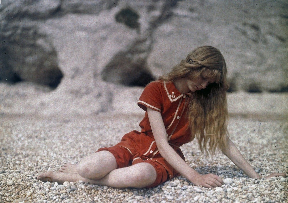
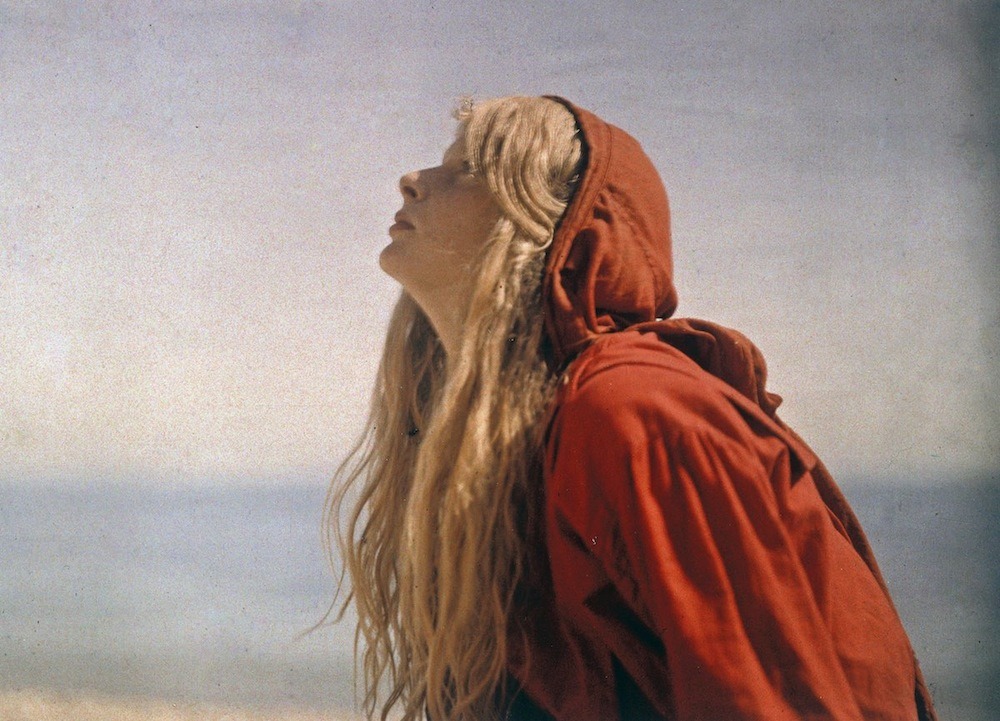
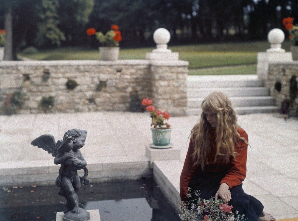
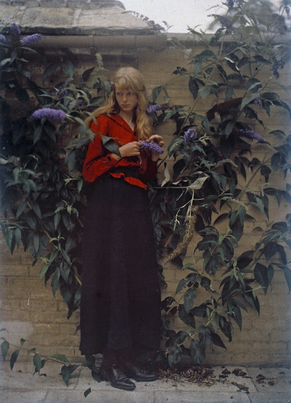
Majority of pictures found here.

Philip Wilson Steer – Vibrant Beach Scenes

22 Aug

The voice of the sea is seductive; never ceasing, whispering, clamoring, murmuring, inviting the soul to wander for a spell in abysses of solitude; to lose itself in mazes of inward contemplation. The voice of the sea speaks to the soul. The touch of the sea is sensuous, enfolding the body in its soft, close embrace.”

(KIate Chopin, The Awakening)

Philip Wilson Steer, Boulogne Sands, 1888-91

Philip Wilson Steer painted some rather dull landscapes and some very atmospheric interiors with dreamy girls, but his most unique and eye-catching paintings are these vivacious and vibrant beach scenes painted in the late 1880s and first half of the 1890s. The radiant colours and the sketchy style is what makes these paintings so unique and extraordinary.

At the age of eighteen, Steer wished to work for the Civil Service but found the entrance exams too demanding. We are fortunate that didn’t occur, for he probably would not have become a painter. He proceeded to study at the Gloucester School of Art and Kensington Drawing Schools, but he wasn’t quite good enough for the Royal Academy of Art. After being rejected by the Academy, Steer went to Paris and there he studied from 1882 to 1884, first at the Academie Julian and then at the École des Beaux Arts where his teacher was Alexandre Cabanel. Despite the years spent at the academies, Steer returned to England not as a Cabanel copy-cat, rather he was more influenced by the works of the Impressionists that he had seen. Steer often visited the picturesque coastal little towns of Walberwick and Southwald in Suffolk, for he had friends there, and he painted people, mostly mothers and daughters, having their holidays in the sun. Despite being inspired by the Impressionist, Steer didn’t go full plein air, that is, he didn’t paint outdoors. Whilst on the beach, Steer would enjoy the scenery and liveliness all around him, take many sketches in his sketchbook and then later turn them into proper paintings in his studio. That way he could capture many fun scenes that happened on the beach in the same day and transform them into canvases full of dots, dashes, textures, sketchy imprecise and harsh brushstrokes.

Philip Wilson Steer, Watching Cowes Regatta, 1892

These beach scenes may appear sketchy and spontaneous, but Steer actually carefully planned each one and often took years to finish them. Each of them has a unique beauty; “Watching Cowes Regatta” has a wonderfully serene harmony of gentle blue tones and is reminiscent of some of Whistler’s paintings, in “Children Paddling” the water just shines and glimmers and the blueness is overwhelming, in “Girls Running” the two figures of girls dressed in matching dresses and matching red sashes is the most striking, and notice how they are not holding their hands, but their shadows are, in “Figures at the Beach” everything disappears in a blueish haze and the three girls in blue and white dresses are as sketchy as can be to still look recognisable, in “The Beach at Walberswick” the red is so intense and pulsating and contrasts beautifully with the blueness of the sea, and in the last painting what strikes me the most is how sketchy and nearly see-through the figures in the foreground are. A wonderful brushwork and a wonderful vibrancy of shades and colours constrasts truly make these beach scenes tangible and alive; one can hear the waves, the seagulls and the laughter of all these girls, feel the magic of the glimmering sea and feel the pebbles or sand underfoot.

“There were days when she was very happy without knowing why. She was happy to be alive and breathing, when her whole being seemed to be one with the sunlight, the color, the odors, the luxuriant warmth of some perfect Southern day. She liked then to wander alone into strange and unfamiliar places. She discovered many a sunny, sleepy corner, fashioned to dream in. And she found it good to dream and to be alone and unmolested.” (Kate Chopin, The Awakening)

Philip Wilson Steer, Walberswick, Children Paddling, 1894

Philip Wilson Steer, Girls Running, Walberswick Pier, 1888-94

Philip Wilson Steer, Figures on the Beach, Walberswick, 1888-89

Philip Wilson Steer, The Beach at Walberswick, 1889

Philip Wilson Steer, Southwold, 1889

Dreamy Autochromes – A Girl in Red On the Beach

4 Jun
“And from then on I bathed in the Poem
Of the Sea, infused with stars and lactescent,
Devouring the azure verses; where, like a pale elated
Piece of flotsam, a pensive drowned figure sometimes sinks;
 
Where, suddenly dyeing the blueness, delirium
And slow rhythms under the streaking of daylight,
Stronger than alcohol, vaster than our lyres,
The bitter redness of love ferments!
(Rimbaud, Drunken Boat)

These wonderful dreamy autochrome photographs of a girl in a red bathing suit at a rocky beach were taken by Mervyn O’Gorman (1871-1958). Similar to the Belgian artist Alfonse van Besten whose autochrome photographs I wrote about before, O’Gorman wasn’t a professional photographer, but rather an engineer with an interest in photography. Alongside knowing the autochrome technique, he clearly had a knack for aesthetic and beauty as well and that is what makes these photographs so timeless and captivating. The thin, pale and pretty strawberry-haired girl was O’Gorman’s daughter Christina and these photographs were taken on a rocky beach in Dorset in 1913. The pictures have a dreamy, nostalgic air which makes them belong to a world of the past, but they also seem modern in some way, maybe it’s because Christina’s poses, setting and even clothes seem modern. Naturally, the kind of bathing suit she is seen wearing is nothing like those she would be wearing today, but when we think of the Edwardian times, an image of a girl on the beach, with bare knees and barefoot certainly isn’t the first thing which comes to mind. There’s a dreamy veil over these photographs, and a tinge of sweet sensuality as well; Christina in her red bathing suit is like a shy poppy flower which starts blooming and, raising its head toward the blue sky, starts being aware of its own beauty and charm. Every time I see the boat in the background of the autochrome above, it makes me think of Arthur Rimbaud’s poem “Drunken Boat”:

“But, in truth, I have wept too much! Dawns are heartbreaking.

Every moon is atrocious and every sun bitter.

Acrid love has swollen me with intoxicating torpor

O let my keel burst! O let me go into the sea!


If I want a water of Europe, it is the black

Cold puddle where in the sweet-smelling twilight

A squatting child full of sadness releases

A boat as fragile as a May butterfly.”

Autochromes from the beach are certainly the most striking, but O’Gorman took many more pictures of his daughter Christina and she is always seen in this lovely, vibrant red which instantly captivates the viewer and brings the attention to Christina. In the last picture you can also see O’Gorman’s wife and other daughter, also on the beach.

Wa and Qi Lolita Styles

19 Mar

These days my senses are ravished by dreams of the East; moss gardens, glowing lanterns and cherry blossom petals carried by the soft spring breeze, exciting Ukiyo-e prints, strange and thrilling music of Toru Takemitsu, old haiku poems… To go along with the theme, of course these gorgeous Lolita dresses caught my attention because they combine the classical Lolita clothes elements; silhouette, cuteness and modest appeal, with the elements of traditional clothes. Wa Lolita is a style of Lolita that combines the classic Lolita style with elements of traditional Japanese clothing (kimono), and Qi Lolita is a very similar style which takes inspiration from the traditional Chinese clothing (qipeo). I love the diversity that Lolita style is capable of and these eye-candy dresses bellow are just a joy to look at, I love the colour palette, lots of red and purple, the intricate patterns, and I love that the head-wear and the accessorize are also inspired by the traditional styles, it just looks stunning all together.

Most pictures found here.